
Small-text designer
You want to assess letterforms and fine details on your main screen, with references on the second screen.


If you mainly assess small text on one screen, prioritise your main monitor’s resolution, screen size and a comfortable scaling setting. Use the second screen for references or tools. If you want to compare the same preview on both screens, choose a setup that lets you check the settings on each display, and make sure your computer supports the two screens and resolutions you need.
You want to assess letterforms and fine details on your main screen, with references on the second screen.
You want to spread previews or workspaces across two screens and need to check how your computer can drive both displays.
You assess colour or print work as well as typography, so you want to know which colour space and adjustment options suit your work.
Choose this setup: if you regularly want to assess the same typography preview on both screens.
Bear in mind: two screens take up desk space, and you’ll need to check the settings on each one.
Choose this setup: if you mainly assess small text on one screen and use the other for references or tools.
Bear in mind: don’t assume colour differences between two different screens mean the displays are identical.
Consider this: if two separate screens aren’t essential and a single continuous workspace suits the way you arrange your windows.
Bear in mind: one ultrawide replaces a setup with two separate displays; it isn’t the same as comparing previews across two screens.
| What to consider | What should you check? | Who should consider this? |
|---|---|---|
| Sharpness of small text | Compare the resolution and screen size of the exact model. Also check that your chosen scaling setting keeps text readable. | If I want to assess letter details on one main screen, I look at both resolution and screen size. Around 33% of consumers rank sharpness of small text as their top priority. |
| Connecting two screens | Check your computer’s video outputs, the inputs and outputs on both monitors, and the maximum number of screens your computer supports. | If I need two displays for previews or workspaces, I want to know in advance whether my computer can drive them both. Around 27% of consumers prioritise reliable connectivity for two screens. |
| Colour across previews | Decide whether you work for web or print, then check the colour modes, stated colour space and calibration options for each model. | If I compare colour as well as lettering, I look at the settings and workflow behind the preview. Around 20% of consumers put colour assessment ahead of other purchasing priorities. |
| Workspace and adjustability | Measure the available space and check for height adjustment, swivel and any VESA mounting options. | If two screens need to fit on my desk, I want to position them comfortably without losing sight of my workspace. Around 20% of consumers name a suitable workspace as their top priority. |
An output on a monitor doesn’t confirm that your computer supports the combination of two screens, resolutions and refresh rates you need.
Before buying, check your computer’s screen limit and video outputs, as well as the connections on both monitors.
Depending on the connections, you may need a different cable or a compatible dock.
A colour space or colour mode alone doesn’t mean that two different, separately adjusted displays will show the same image.
For colour-critical previews, check the colour modes and calibration options of both exact models.
Setting up or calibrating both screens may take extra time.
Two monitors need space and an arrangement that positions the main screen comfortably in front of you.
Measure your desk and the footprint of the stands, and plan how you want to position the screens.
You may need a monitor arm or a different desk layout.
These models and product ranges offer different combinations of resolution, connections and colour management. Always check the specifications of the exact variant.
The UltraSharp U2725QE is a 27-inch 4K option with multiple connections for use as a main screen.
The DesignVue PD2705Q is a 27-inch QHD design monitor with an sRGB mode and DisplayPort output.
According to ASUS Netherlands, the ProArt PA279CRV combines a 27-inch 4K panel with colour modes and DisplayPort daisy-chaining.
The ColorEdge CS2740 is a 27-inch 4K model for anyone who needs colour management as well as typography.
According to LG Netherlands, the UltraFine 27UP850K-W is a 27-inch 4K monitor with USB-C and an adjustable stand.
This selection features 27-inch 4K monitors that you can use as a main screen alongside an existing display. Check that each model’s connections and screen support are compatible with your computer and setup.
 No image available
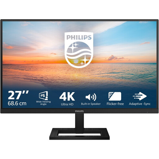
Can serve as a 4K main screen for assessing fine letter details alongside an existing display.
3840 × 2160; 60 Hz; 4 ms; HDMI and DisplayPort inputs; height-adjustable stand; EasyRead mode.
 No image available
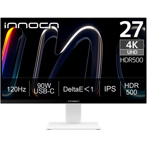
A 27-inch 4K option to compare if stated colour coverage or image sources matter to you as well as typography.
3840 × 2160; 120 Hz; 90 W USB-C; HDMI and DisplayPort; PIP and PBP functions; height adjustment and pivot. The product listing states 99% Adobe RGB.
 No image available
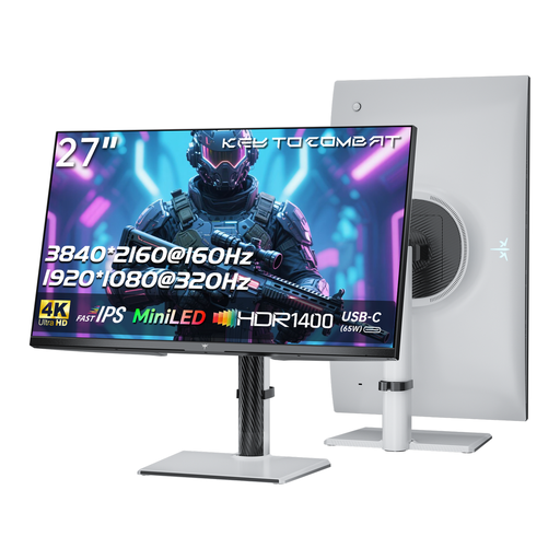
Its 4K resolution makes this model worth comparing with other 27-inch screens for typography work.
4K 160 Hz / Full HD 320 Hz; 65 W USB-C; KVM; height-adjustable stand.
 No image available
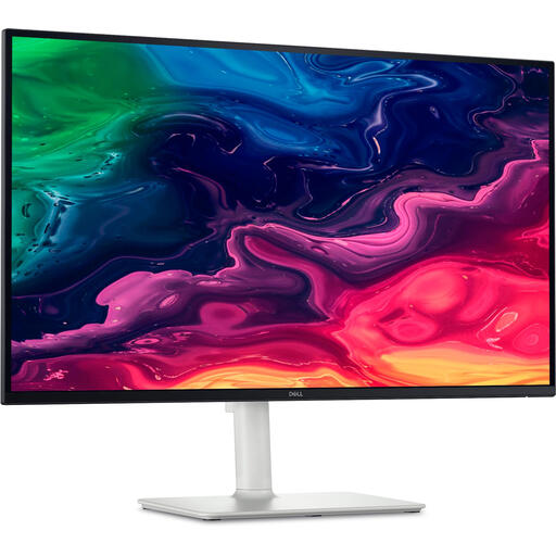
A 27-inch 4K option to consider as a main screen alongside an existing display. Check that its connections suit your computer.
3840 × 2160; HDMI and USB-C; 65 W USB-C Power Delivery; height-adjustable stand.
 No image available
A 27-inch 4K main screen to compare if connection options are important for your two-screen setup.
3840 × 2160; the product listing states 99% DCI-P3. RTINGS lists Thunderbolt and DisplayPort video outputs for this model.
No. The monitor connections alone don’t tell you that. Check the screen limit of your exact computer, along with the supported resolution and refresh rate. Apple Support notes that this varies by Mac model.
No. A stated colour space alone doesn’t guarantee that a preview will match a print. EIZO explains that factors including the screen, system settings, software and printer can all have an impact. First decide which colour workflow you’ll use, then check the settings and calibration.
Place the screen you use most directly in front of you. Arboportaal advises positioning the top of the screen slightly below eye level. Position the second screen to suit the tasks you’ll use it for.
Compare the energy information for the exact models on the EU energy label and in the product information sheet. The European Commission notes that the energy label for displays includes an efficiency class and information to help you compare products.