First, choose a tablet that lets you comfortably enlarge the film review websites you use; a larger screen doesn’t guarantee this. A model around 11 inches is easier to handle, while 12 to 13 inches gives you more room if you usually read at home, but may be less comfortable to hold for long periods. You can test your own websites and check the exact model before you buy.
Who is this buying guide for?
Readers who need large print
You read film reviews online and want to adjust text size and contrast. Test the websites you use, as text settings don’t work the same way everywhere. Apple Support and Google Android Accessibility explain the limitations in different apps.
Readers who want a clear view at home
You usually read longer articles at a table and want to see more lines at once when using larger text. Weigh the extra screen space against the tablet’s size and weight; Apple Nederland and Apple Support publish specifications for individual models.
Readers who take their tablet with them
You also read on the go or often hold your tablet, and want a practical balance between screen space and portability. Compare the dimensions and stated weight of the exact model.
What should you look for when choosing?
Around 11-inch iPad
Suitable for: anyone who reads web articles on a more portable device and wants to try text settings on their iPad or in Safari.
The trade-off: Apple lists the 11-inch iPad (A16) with Wi-Fi at 477 grams; Dynamic Type only works in apps that support this feature.
Around 11-inch Android tablet
Suitable for: anyone looking for a more portable size who can test their own websites and browser on the specific tablet.
The trade-off: Google says the Android font size setting doesn’t apply in every app.
12 to 13-inch tablet
Suitable for: anyone who usually reads at a table or with the tablet on a stand and wants more screen space when using larger text.
The trade-off: a larger device may be less portable. Apple Support lists the 13-inch iPad Air (M4) with Wi-Fi at 616 grams, compared with 477 grams for the 11-inch iPad (A16) with Wi-Fi. These are specifications for different product ranges, not the results of a user test.
| What to consider |
What to look for |
Who is this important for? |
| Web text you can enlarge |
Test a film review page you use in your preferred browser, with larger text and suitable contrast. Also check that navigation and buttons remain easy to use. |
If I want to read the websites I usually visit in larger print, I want to make sure the text scales properly there; around 36% of consumers say readability is their top priority. |
| A clear view of long articles |
Compare the same page at your preferred text size on a device around 11 inches and one that’s 12 to 13 inches. Also consider whether you’ll prop the tablet up. |
When I read a long review, I want more screen space with larger text; around 29% of consumers say having a clear view comes first. |
| Portability |
Compare the stated weight and dimensions of the exact model. Consider whether you’ll usually hold the tablet or prop it up. |
If I read on the go or hold the tablet for a long time, I want a size that suits me; around 21% of consumers say portability is the deciding factor. |
| Model and what’s included |
Check the model code, storage, Wi-Fi or mobile data version, and which accessories are included in the offer. |
When I mainly read online, I don’t want to pay for features or accessories I don’t need; around 14% of consumers put keeping purchase and running costs under control first. |
Pitfalls to avoid
-
Choosing based on screen size alone
Text enlargement varies between apps and websites. Larger text also means less text fits on screen at once.
Try the same film review at your preferred text size before choosing a screen size.
-
Assuming every model in a range is the same
Models in the same product range may differ in storage, connectivity and included accessories.
Before buying, check the full model code, storage, connectivity and what’s included in the box.
-
Assuming a manufacturer’s warranty limits all your rights
A commercial warranty is separate from your statutory rights if a product doesn’t do what you can reasonably expect when used normally.
Keep your proof of purchase and contact the seller if there’s a fault. Consider any additional commercial warranty separately.
Brands to compare
Apple
The 11-inch iPad (A16) is a more portable option, while the 13-inch iPad Air (M4) has a larger screen.
- Apple explains text settings for apps that support Dynamic Type, as well as text size adjustments in Safari. Apple Nederland lists the weight for each model.
- Support for Dynamic Type varies between apps. A larger screen alone doesn’t tell you whether a website will be comfortable to read.
Samsung
The Galaxy Tab A11+ range includes 11-inch Android models; check the individual Wi-Fi and storage options.
- Samsung Nederland lists the Galaxy Tab A11+ SM-X230NZAPEUB as a Wi-Fi model with 256 GB of storage.
- Google says the Android font size setting doesn’t apply in every app, so test your own reading setup.
Lenovo
The Idea Tab is an 11-inch Android option for anyone who also wants to take notes; the exact pen and bundle configuration matters.
- For model ZAFR0399SE, Lenovo lists features including an 11-inch IPS display and 256 GB of storage.
- Check which accessories are included with the model on offer; the product range name doesn’t tell you which bundle you’ll receive.
Xiaomi
The Redmi Pad 2 is an 11-inch Android option with a reading mode described by Xiaomi.
- Xiaomi lists a resolution of 2560 × 1600 pixels and a reading mode for the Redmi Pad 2.
- These specifications don’t prove that every film review website will scale properly or that the screen will be comfortable for every reader.
Tablets at Joybuy
This selection includes tablets around 11 to 13 inches for reading film reviews online, from more portable models to options with more screen space.
 No image available
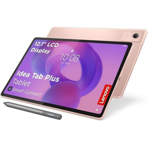
Lenovo Idea Tab Plus 12.1 inch, 2.5K, 8 GB RAM, 256 GB, with Pen
The 12.1-inch screen is suited to reading with extra screen space; the product description mentions web browsing and an included Lenovo Pen.
The product name lists a 2.5K screen, 8 GB RAM, 256 GB of storage and the colour Rose.
View at Joybuy
 No image available
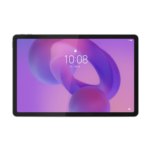
Lenovo Tab K11 Gen 2, 11 inch, 2.5K
The 11-inch size suits anyone looking for a more portable tablet for online articles; try your preferred text size on the websites you use.
The product name lists a 2.5K screen and model code ZAFS0069CZ.
View at Joybuy
 No image available
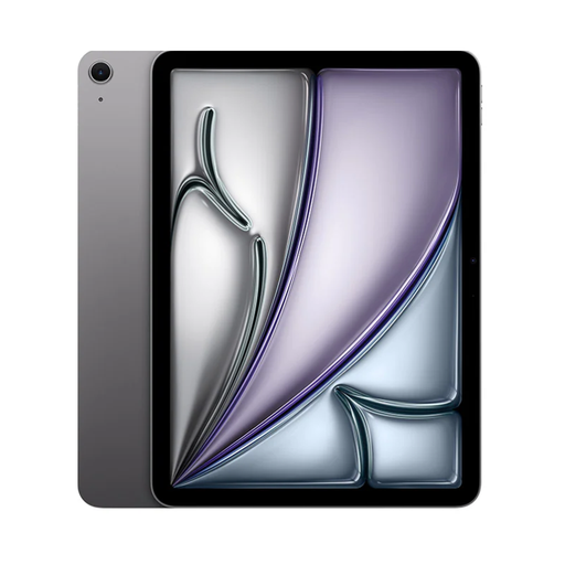
Apple 11-inch iPad Air (M4), Wi-Fi, 256 GB, Space Grey
The 11-inch size is a more portable screen option; Apple describes text settings for supported apps and Safari.
The product name lists Wi-Fi, 256 GB of storage and the colour Space Grey. Check whether your own websites display text at your preferred size.
View at Joybuy
 No image available
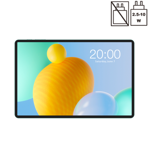
TECLAST P50, 11 inch, Android 16, 128 GB
The 11-inch size is an option for anyone looking for a more portable tablet; check how your preferred text size works in your browser.
The product name lists Android 16, 128 GB of storage and 4G LTE. Google says the Android font size setting doesn’t work in every app.
View at Joybuy
 No image available
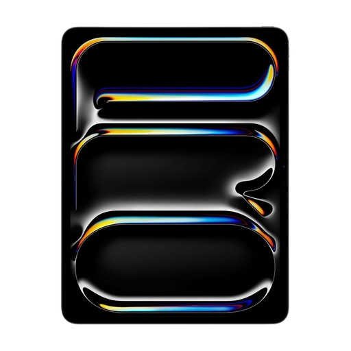
Apple 13-inch iPad Pro, Wi-Fi and cellular, 256 GB, Space Black
A 13-inch screen gives you more physical space for larger text. This size is particularly suited to reading with the tablet propped up when extra screen space matters.
The product name lists Wi-Fi, cellular, 256 GB of storage and Space Black. Apple describes text settings for supported apps and Safari.
View at Joybuy
Frequently asked questions
Will text get larger in every film review app or on every website?
No, it won’t work everywhere. Apple Support explains that Dynamic Type depends on app support; Google Android Accessibility notes exceptions to the Android font size setting. Test the website or app you use before choosing a screen size.
How do you make the text larger?
On an iPad, start at Settings > Display & Brightness > Text Size. For even larger text, you can also go to Accessibility > Display & Text Size > Larger Text. On Android, search for Font size in Settings. Then check that text and controls remain comfortable to use on the websites you visit regularly.
Is a larger screen always more comfortable for reading long film reviews?
Not necessarily: a larger screen gives you more physical space, but is usually less comfortable to hold for long periods. Choose 12 to 13 inches if you mainly read with the tablet propped up and extra screen space matters; consider around 11 inches if you take it with you or hold it more often. Also test your preferred text size on the websites you use.
What warranty applies to a tablet in the Netherlands?
According to ACM ConsuWijzer, a product should do what you can reasonably expect it to do when used normally. If a product is faulty, the seller is responsible for providing an appropriate solution; an additional commercial warranty doesn’t replace your statutory rights.
Can you try and return a tablet bought online?
For an online consumer purchase covered by the statutory cooling-off period, this period usually ends 14 days after delivery, according to ACM ConsuWijzer. Check the terms for trying and returning the specific item you’re buying; this is separate from your rights if the product is faulty.