
Printed cover designer
You want to check your colour choices against the intended printing method, rather than relying on an attractive-looking screen. Adobe explains how a monitor profile works alongside the profile for your printer, ink and paper.


For a printed poetry book cover, colour management, calibration and a suitable profile for your printer, ink and paper matter more than a vivid-looking screen alone; Adobe describes these elements as interdependent. If your portfolio is mainly digital, give more attention to crisp text and plenty of workspace. In either case, check that the connections are compatible with your computer: no monitor can, by itself, make paper show the same colours as your screen.
You want to check your colour choices against the intended printing method, rather than relying on an attractive-looking screen. Adobe explains how a monitor profile works alongside the profile for your printer, ink and paper.
You assess small lettering, line spacing and the complete cover alongside your design panels. Adobe’s booklet guidance highlights, among other things, the importance of physical margins and bleed when preparing artwork for print.
You want to connect the monitor to your existing computer, so you’ll need to consider ports, power delivery and adjustability. Check that your computer’s connection supports video and, if you want to use a single cable, can also supply enough power.
First decide whether you’ll present the cover in print or mainly digitally. Then compare text clarity, connections and the colour-management tools you already have.
| What to consider | What should you check? | Who is this important to? |
|---|---|---|
| Predictable colour for print | Check the stated colour gamut, calibration options and suitable output profile. For a print job, also assess a proof on your chosen paper. | If my cover is going to be printed, I want to match my colour choices to the intended output. Around 33% of consumers put colour for print first. |
| Fine typography and a clear overview | Compare the native resolution and screen size with your desk space. View the lettering both zoomed in and with the complete cover on screen. | I want to assess small lettering and white space without losing sight of the overall cover. Around 27% of consumers give typography and composition top priority. |
| Connections and positioning | Check your computer’s video output, the cable or adapter required and any charging support. Also look for height and tilt adjustment. | I want to connect my existing computer and position the screen comfortably in my workspace. Around 20% of consumers put workspace compatibility first. |
| Required equipment and maintenance | Compare the features with how you’ll use the monitor, and check which cables and calibration tools you already have. | I only want to take on extra features and tasks that my cover and portfolio work genuinely require. Around 20% of consumers put the overall effort involved in buying and maintaining a monitor first. |
A screen and a printer or printing process reproduce colour in different ways. So a stated colour gamut alone can’t tell you how the cover will look on paper.
Match your screen settings to the intended output and use suitable profiles. If the printed result is critical, assess a physical proof.
Colour management can take extra time for profiles, calibration and assessing a print proof.
The monitor and computer must both support the video connection you choose. A monitor’s charging capability may also differ from what your laptop requires.
Compare the connection specifications of both devices and check the cable before relying on a single-cable setup.
Depending on your workspace, you may need a different cable or adapter, or have to power your laptop separately.
HDR or specialist reference features aren’t automatically necessary for designing or presenting a standard poetry book cover digitally.
First work out what your workflow requires in terms of output and features. If you’re considering a specialist monitor, check that it’s compatible with your computer.
Features you don’t use add more decisions without, by themselves, making the printed result more predictable.
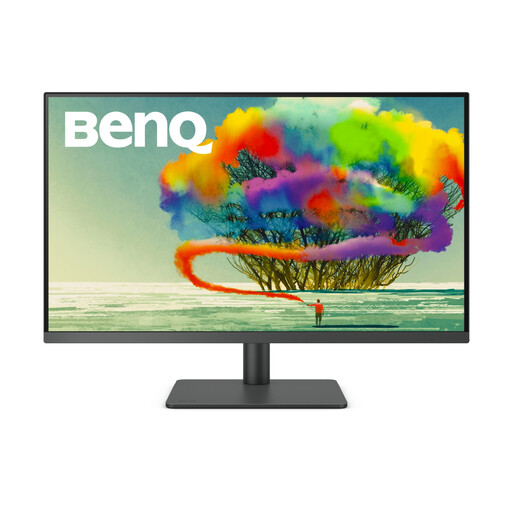
BenQ positions the PD2732U for graphic design workflows that bring digital and printed output together.
EIZO lists the ColorEdge CS2740 as an option for graphic design, image editing and more.
According to ASUS’s specifications, the ProArt PA279CRV combines a 27-inch 4K screen with stated coverage of several colour spaces.
The UltraSharp U2725QE is a 27-inch 4K model with a hub function, according to Dell.
LG describes the UltraFine 27UP850K-W as a 27-inch 4K IPS monitor with USB-C and an adjustable stand.
This selection includes monitors for colour preparation, typography and assessing a cover in a digital workspace. Stated colour spaces are no substitute for colour management or checking printed output.
 No image available
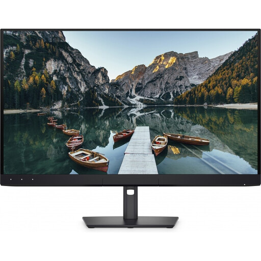
The product information lists Adobe RGB coverage and an integrated colourimeter for colour-focused design work.
32-inch 4K UHD; the description lists 94% Adobe RGB and an integrated automatic colourimeter. A monitor profile doesn’t replace a suitable profile for your printer, ink and paper.
 No image available
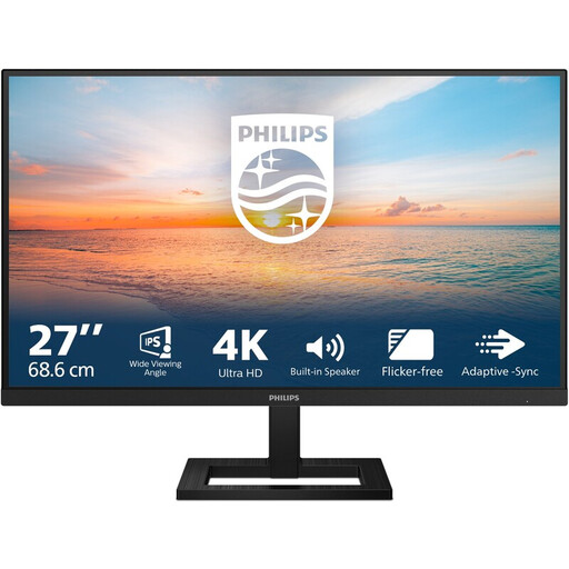
This monitor could suit you if you want to view fine lettering and the composition of a digital cover on a 27-inch screen.
3840 × 2160 pixels; the product title lists HDMI, DisplayPort and a height-adjustable stand. Check which connection is compatible with your computer.
 No image available
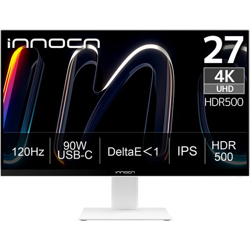
The product information lists Adobe RGB coverage for anyone preparing colour choices for a print-focused cover.
3840 × 2160 pixels; the description lists 99% Adobe RGB, USB-C with 90 W Power Delivery and a height-adjustable stand. Check that the connection and power delivery suit your computer.
 No image available
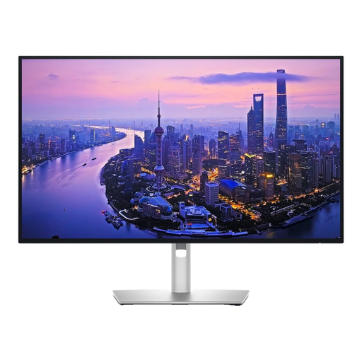
This model could suit you if you’re looking for a 27-inch 4K screen with connections for a digital design workspace.
3840 × 2160 pixels; the product information lists 99% DCI-P3 and Display P3, as well as Thunderbolt, HDMI and DisplayPort. DCI-P3 coverage doesn’t guarantee a match with printed output.
 No image available
The 31.5-inch screen could suit a workspace where you want to assess the cover alongside your design software.
3840 × 2160 pixels; the product information lists 99% sRGB, Rec. 709, USB-C with 90 W Power Delivery and a built-in KVM switch. The stated colour space alone can’t predict the print result.
No. That percentage describes a stated screen colour gamut, not the colours produced by your chosen printer, ink and paper. For a print job, use suitable profiles and, if necessary, assess a physical proof.
Recalibrate and reprofile your monitor if you work with colour-critical content. Adobe recommends doing this after a significant change to your screen settings or workspace lighting; it’s workflow advice, not a legal requirement.
According to ACM ConsuWijzer, for a typical online consumer purchase you have a statutory 14-day cooling-off period after delivery. The statutory guarantee is separate; an additional manufacturer’s warranty doesn’t replace your statutory rights.
EU energy labelling rules generally cover electronic displays, including monitors, subject to specified exceptions. The rules set out obligations for suppliers and sellers; for a specific model, check the applicable energy label and product information sheet.