
Card designer working beside a window
If you work in bright daylight, don’t focus only on the screen coating. Arboportaal recommends sitting with your line of sight parallel to the window and using blinds or curtains.


Start with where you position your screen: Arboportaal recommends sitting with your line of sight parallel to the window and using suitable blinds or curtains to reduce distracting daylight. Then choose a monitor based on what matters most when you make word cards: checking small text and details, preparing colours for print, or making sure your computer and workspace work well together. An anti-glare surface or higher brightness alone cannot guarantee a reflection-free picture next to every window.
If you work in bright daylight, don’t focus only on the screen coating. Arboportaal recommends sitting with your line of sight parallel to the window and using blinds or curtains.
If you check small words, alignment and several elements, compare the resolution and screen size with the scale at which you actually view your designs.
If you print your cards, consider the colour settings and output device profile as well as the monitor specifications.
First adjust your workspace to account for daylight. Then compare monitors based on the task that matters most for your word cards.
| What to consider | What to look for | Who is this important for? |
|---|---|---|
| Reflections beside a window | Try sitting with your line of sight parallel to the window and using suitable blinds or curtains. Compare anti-glare coatings and typical brightness; don’t confuse the latter with peak HDR brightness. | If daylight falls on your screen, start by addressing the light and screen position. Around 33% of consumers prioritise controlling reflections. |
| Small text and card layouts | Compare the screen size and resolution with your own files and the viewing scale you use. A higher resolution alone doesn’t determine how large text appears on screen. | If you work with small words and several card elements, check that you can review them comfortably at your usual scale. Around 27% of consumers prioritise checking these details. |
| Colour for print | Check both the monitor’s colour space and the colour profiles for your document and output device. A stated colour gamut alone doesn’t prove that the screen will match a print. | If you print word cards, your whole colour workflow matters, not just the monitor specifications. Around 20% of consumers focus primarily on colour checks for print. |
| Workspace and computer connections | Check which video port is available, along with the cable and any USB-C power delivery. Also check that the stand offers enough adjustment for your desk. | If you want to set the screen at a particular height or connect your laptop using one suitable connection, check that your computer and monitor are compatible. Around 20% of consumers prioritise connectivity and workspace setup. |
A screen specification describes the model, but it can’t guarantee how the picture will look with the light and window position at your desk. Arboportaal also recommends considering your line of sight and using blinds or curtains.
First check where the daylight is coming from, then compare the typical brightness of monitors on a like-for-like basis. Don’t treat it as the same as a peak HDR figure.
You may need to rearrange your workspace or use blinds or curtains.
The colours in a print also depend on the colour settings and profile of the output device.
Check your document and printer profiles. Adobe explains that InDesign can convert colours when printing, using the selected printer profile.
A proof print or additional colour check may be part of your workflow.
The monitor, cable and computer must all support the video connection you intend to use and the power your laptop needs.
Before relying on it, check your computer’s port, the monitor connection, the cable and your laptop’s power requirements.
You may also need a separate laptop power supply or a suitable cable.
An additional warranty product does not replace your statutory rights if a product does not conform to the contract.
Read what extra cover is offered and how it adds to your statutory rights.
The ProArt PA279CRV is a 27-inch 4K monitor for a colour-focused design workspace.
The DesignVue PD2705U is a 27-inch 4K option for card layouts and a colour-focused workflow.
The 27E1N1800AE/00 is a 27-inch 4K IPS monitor with a height-adjustable stand.
The UltraSharp U2724D is a 27-inch QHD option if adjustability matters more to you than 4K resolution.
The UltraFine 27UP850K-W is a 27-inch 4K IPS option with USB-C and an adjustable stand.
This Joybuy selection features 4K monitors for viewing card text and layouts, with a range of screen sizes and stated features for connectivity, adjustability or colour workflows.
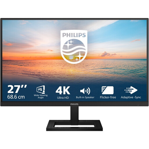 Image unavailable
Could suit card layouts if you want to review small text and designs on a 27-inch screen.
4K UHD, 3840 × 2160; IPS; 60 Hz; 4 ms; height-adjustable stand.
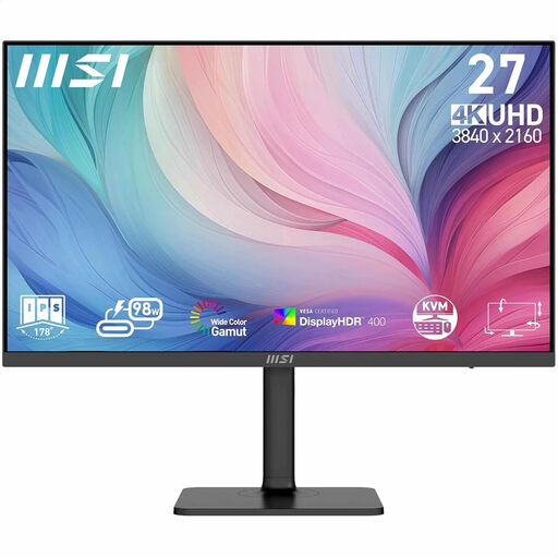 Image unavailable
Could be a good fit if you’re looking for a 27-inch 4K screen to check details in your card designs.
3840 × 2160 pixels; the product description lists factory calibration, 97% DCI-P3 and 94% Adobe RGB coverage.
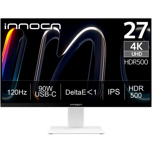 Image unavailable
Could suit you if you want to view small card details and are looking for a non-glossy screen surface.
3840 × 2160; IPS; 120 Hz; USB-C 90 W PD; the product description lists a non-glossy surface and a height-adjustable stand.
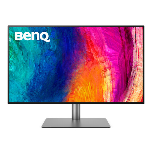 Image unavailable
Could be a good fit if you want to view card elements across a 32-inch workspace.
3840 × 2160 pixels; anti-glare surface; the product description lists Calman Verified and Pantone Validated.
 Image unavailable
Could suit you if you’re looking for 27-inch 4K detail and want to consider its stated reflection-reducing feature.
The product description lists 99% DCI-P3, Display P3, an ambient light sensor and a low-reflection feature.
Start with your setup: Arboportaal recommends sitting with your line of sight parallel to the window when working at a screen, and using suitable blinds or curtains to reduce reflections from daylight. Then compare the typical brightness and coating of specific models; a brightness specification doesn’t guarantee that reflections will disappear.
Check your document’s colour settings and the profile of the output device. Adobe explains that InDesign can convert colours when printing, using the selected printer profile. A monitor’s stated colour gamut alone is therefore not enough.
Only if your laptop’s port, video connection and power requirements are compatible with the monitor. BenQ specifies USB-C with DisplayPort Alt Mode, data and 65 W Power Delivery for the PD2705U; ASUS lists USB-C with DisplayPort Alt Mode and 96 W Power Delivery for the PA279CRV. Check the requirements of your laptop and cable.
Check the EU energy label and product information sheet for the exact model. According to the European Commission, computer monitors are covered by the A to G energy label; it also shows the screen size and resolution.
For distance purchases, you’ll often have a 14-day cooling-off period; check the terms that apply. You’re also entitled to a satisfactory product under the statutory guarantee. If there’s a problem, contact the seller, even if a manufacturer’s warranty or paid extended warranty is available.