
Developers testing enlarged text
You want to check whether forms, messages and navigation remain readable and usable when text or the page is enlarged.


An adjustable 27-inch QHD monitor is a sensible starting point if you want to assess an editor and browser preview side by side while building your site, but it isn’t essential. A more compact Full HD screen may suit a small desk, while 4K offers more detail, provided your computer supports it over the video connection you choose and you set the scaling to a comfortable level. No monitor makes a website accessible on its own: test text enlargement and reflow in the browser too.
You want to check whether forms, messages and navigation remain readable and usable when text or the page is enlarged.
You switch between code or content and a browser preview, and want enough working space to view both at your chosen text size.
You’re looking for a screen size that fits your workspace and want to check whether your laptop’s connection supports video and, if needed, charging too.
A good fit if: you regularly want to assess an editor and browser preview side by side, and both remain readable at your chosen text size.
Bear in mind: the desk space required and how your windows are arranged when you enlarge text.
A good fit if: desk space is your priority and you mainly assess one window at a time.
Bear in mind: you’ll have less room to use windows side by side when enlarging text.
A good fit if: you want to view fine details as well as text, and your computer can display 4K over your chosen connection.
Bear in mind: you’ll need a suitable scaling setting; more pixels don’t automatically mean more usable workspace with enlarged text.
| What to consider | What should you check? | Who is this important for? |
|---|---|---|
| Readability and enlargement | Try your usual text size, system scaling and browser zoom. Also check that the website remains visible and usable when enlarged. | If I want to assess forms and navigation with enlarged text, I need to see what remains readable without content disappearing. Around 36% of consumers give readability and text enlargement their top priority. |
| Editor and browser side by side | Assess your window layout at the scaling level you actually use, and check that your desk and computer can accommodate your chosen monitor. | If I want to see code or content alongside a browser preview while building, usable workspace at my chosen text size matters. Around 29% of consumers prioritise space for using windows at the same time. |
| Workspace and adjustability | Measure the space available on your desk and check the adjustment options for the exact model. | If my desk has limited space or I want to adjust the screen to suit my workspace, size and adjustability are important. Around 21% of consumers make workspace fit their top priority. |
| Connection to your laptop or computer | Compare your computer’s video output with the monitor’s connections. For USB-C, also check video support, the cable and the charging capacity required. | If I want to connect a laptop and potentially charge it through the same connection, I check that all the components are compatible. Around 14% of consumers prioritise computer compatibility. |
Usable space also depends on your text size, scaling setting and video output. Enlarging text can leave less room for windows side by side.
Assess the monitor using the enlargement level you normally use, and check before buying that your computer can display 4K over your chosen connection.
A USB-C connection alone doesn’t confirm that a monitor can transmit video or charge your laptop at the required capacity.
Check the features of the exact monitor model, laptop and cable separately.
A design that fits on a wide screen may cut off content at higher browser zoom or require awkward horizontal scrolling.
Test the website in a narrow browser window too, and check forms and controls as well as the text.
According to ACM ConsuWijzer, the statutory guarantee is separate from any guarantee offered by the retailer or manufacturer.
Read the terms for any additional cover and, if there’s a problem, consider your legal rights with the retailer too.
Dell’s Dutch Pro Plus range includes the 27-inch QHD models P2725D and P2725DE; the P2725DE is the USB-C hub version.
The Dutch 1000 Series includes the compact 24E1N1300AE/00 with Full HD and the 27E1N1600AE/00 with QHD.
The Dutch UltraFine 27U710B-B is a 27-inch 4K model for anyone who wants to assess images and fine details as well as text.
The Series 5 Pro 527pq is a 27-inch QHD monitor for work, with adjustment options and HDMI and DisplayPort.
These monitors suit different ways of building and testing a website: an adjustable QHD screen, a compact Full HD model, 4K models and an ultrawide screen.
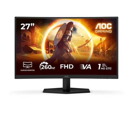 No image available
An option for assessing an editor and browser preview side by side, with an adjustable stand.
27 inches; 2560 × 1440 pixels; height, tilt, swivel and pivot adjustment; HDMI and DisplayPort.
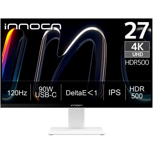 No image available
A 4K option for viewing fine details; adjust the scaling and check that your computer and cable are compatible.
27 inches; 3840 × 2160 pixels; IPS; USB-C with 90 W Power Delivery; HDMI and DisplayPort; adjustable stand.
USB-C video and charging depend on laptop and cable compatibility; the stated charging capacity doesn’t guarantee that it will charge every laptop.
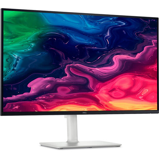 No image available
A 4K screen for assessing text and detail as you build; check the scaling setting and connection to your computer.
27 inches; 3840 × 2160 pixels; IPS; HDMI and USB-C; height-adjustable stand.
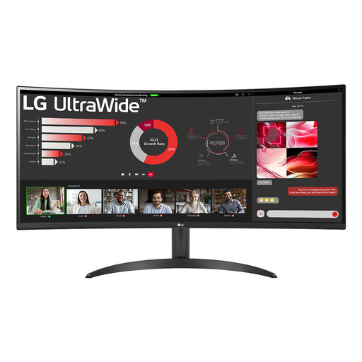 No image available
An ultrawide screen for viewing an editor and browser preview side by side; check that the layout works at your chosen text size.
34 inches; 3440 × 1440 pixels; 100 Hz; HDMI and DisplayPort; Picture-by-Picture; height and tilt adjustment.
 No image available
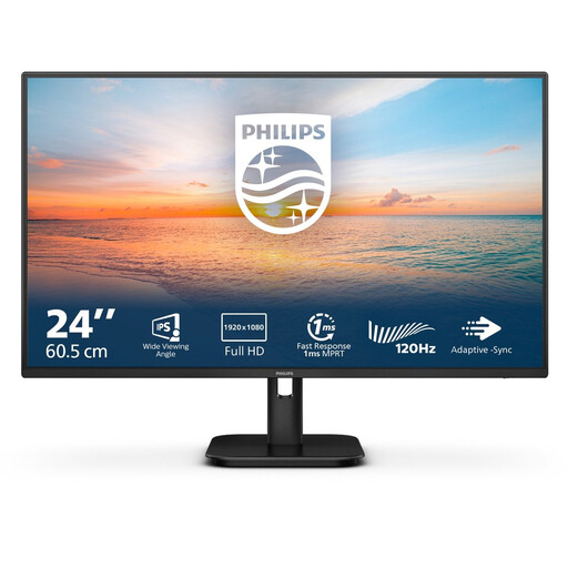
A compact option for a smaller workspace and mainly assessing one window at a time.
24 inches; Full HD; IPS; 100 Hz; speakers; HDMI and VGA.
This size offers less room for an editor and browser side by side than a 27-inch QHD screen.
No. The monitor doesn’t determine whether the website remains usable when text is enlarged. The W3C Web Accessibility Initiative sets out criteria for enlarging text to 200% without loss of content or functionality, and for reflow at a narrow viewport, with exceptions for certain content. Test this in the browser; these are website criteria, not monitor specifications.
Adjust the screen and your workspace so that characters are easy to read and distracting reflections are kept to a minimum. Arboportaal also recommends adequate ambient lighting, varying your posture and taking short breaks from looking at the screen; these are guidelines for screen work, not a promise that a particular monitor model will prevent discomfort.
No. Check that your laptop supports video over USB-C and that the exact monitor model and cable provide the video functionality and Power Delivery you need. Dell positions the P2725DE as a USB-C hub monitor; check the features of your chosen model and laptop separately.
For an online consumer purchase in the Netherlands, you generally have a statutory 14-day cooling-off period after delivery, subject to legal exceptions; ACM ConsuWijzer explains these rules. You’re also covered by the statutory guarantee if the product doesn’t meet reasonable expectations under normal use. A manufacturer’s warranty period doesn’t determine your statutory rights.