
Developer working with code and a browser side by side
You want to work on the portal and check the desktop view at the same time; screen space and legible text are your priorities.


Choose a monitor based on what you usually want to view at the same time: code and a browser, long code files or visual designs. Then compare screen space, resolution, connections and adjustability. A monitor or browser emulation cannot replace testing mobile views at different widths and, for important interactions, on a real mobile device.
You want to work on the portal and check the desktop view at the same time; screen space and legible text are your priorities.
You review components, images and views at different widths. Colour features may be useful, but emulation is no substitute for testing on a real mobile device.
You switch between your laptop and desk and want to connect the display and peripherals, and possibly charge your laptop, too. The connection and charging power need to suit both devices.
A good fit for: anyone who usually works with an editor and browser side by side and doesn’t need 4K or an unusual aspect ratio.
The trade-off: the QHD models listed have fewer pixels than the 4K and 3840 × 2560 options. Text scaling and window size also affect how comfortable the layout is to use.
A good fit for: anyone who mainly views long code files or pages.
The trade-off: check separately whether there’s enough width for the browser preview you want to display beside your code.
A good fit for: anyone who spends a lot of time reviewing images, icons and colours as well as programming.
The trade-off: check that the text scaling is comfortable. Manufacturer colour specifications aren’t an independent measurement of your individual monitor.
| What to consider | What should you look for? | Who is this important for? |
|---|---|---|
| Room for code and a browser | Compare screen size, resolution, aspect ratio and the window layout you usually use. | If I want to edit code while keeping the browser open, I look for a layout with legible text and enough room for both windows. Around 33% of consumers put this workspace first. |
| Checking responsive layouts | View the page at several viewport widths and test important mobile interactions on a real device, too. | If I want to see how the portal behaves at different screen widths, I look for a workflow that lets me check those variations. Around 27% of consumers prioritise this kind of testing. |
| Connecting a laptop and peripherals | Check USB-C video, Power Delivery, your laptop’s charging requirements and any other ports you need. | If I want to use my laptop at my desk with as few separate connections as possible, I compare the capabilities of both devices. Around 20% of consumers make compatible laptop connections their top priority. |
| Reviewing visual details | Compare resolution, colour modes and calibration features; decide whether design work is a main task. | If I want to review components and images alongside code, I also look at the colour features and their specifications. Around 20% of consumers prioritise visual checks. |
Your desktop monitor’s resolution doesn’t automatically test mobile viewports or how a site behaves on a real device. Google’s Chrome for Developers describes Device Mode as a first approximation.
Check your portal at several viewport widths and test important interactions on a real mobile device, too.
USB-C video and charging power are separate compatibility requirements, and your laptop needs to support the features on offer.
Compare the specifications of both devices and check which cable you’ll need.
Depending on the combination, you may also need a separate charger or a different video connection.
An additional warranty doesn’t replace your statutory rights if a product is faulty.
First compare your statutory rights with any additional cover. ACM ConsuWijzer states that the statutory guarantee exists alongside the seller’s guarantee.
The Pro Plus P2725DE is a QHD option for a laptop setup with USB-C hub features.
The RD280U is a 3:2 option to consider if you want extra vertical space.
The ProArt PA279CRV is a 27-inch 4K option for anyone who also reviews visual designs.
The 27UP850K-W is a 27-inch 4K option with USB-C and an adjustable stand.
The 27E1N1600AE/01 is a QHD option with USB-C for a laptop setup.
This selection includes desktop monitors with QHD and 4K options for work involving code, browser pages or design details.
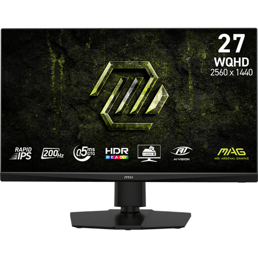 No image available
A QHD option for viewing code and a browser on one desktop screen; choose the window layout and text scaling that work for you.
27 inches, 2K WQHD, Rapid IPS and 200 Hz, according to the product name.
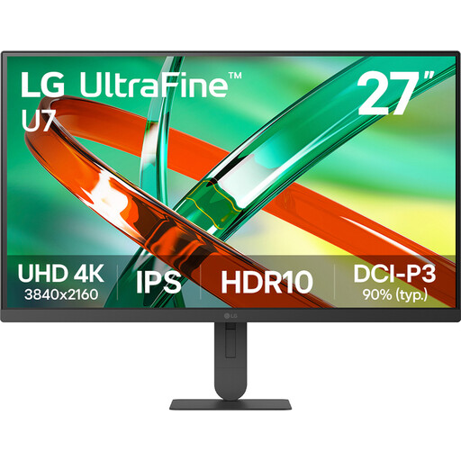 No image available
A 4K option for viewing design details on a desktop screen; choose a text size that’s comfortable and easy to read for your work.
27 inches, 4K and IPS, according to the product name.
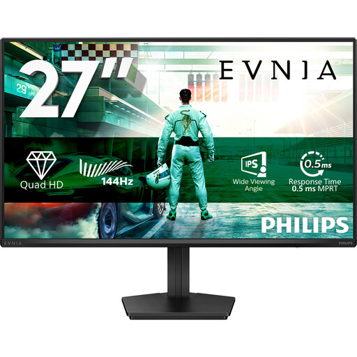 No image available
A QHD option for a desktop layout with code and a browser; check how your windows and text scaling look on screen.
27 inches, QHD, IPS and 144 Hz, according to the product name.
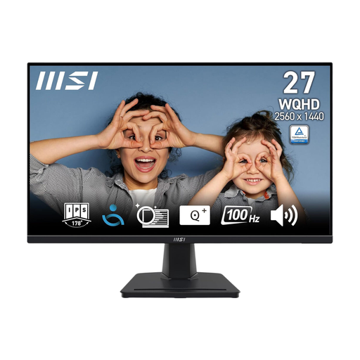 No image available
A QHD option for work with code and a browser on the same desktop screen; tailor the window layout to suit the way you work.
68.6 cm (27 inches), 2560 × 1440 and Wide Quad HD, according to the product name.
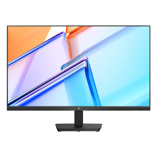 No image available
A QHD option for a permanent workspace where code and a browser appear together; check that the text scaling suits you.
27 inches, QHD 2560 × 1440, IPS and 120 Hz, according to the product name and description.
No. Responsive design is about how a site displays across different screen sizes and resolutions, not about having a phone’s screen resolution on your monitor. Chrome DevTools can simulate a mobile viewport, but Google describes this as a first approximation. If in doubt, test on a real mobile device, too.
No. Check that the specific monitor supports USB-C video and Power Delivery, and that your laptop supports the video connection and can work with the charging power on offer. Dell lists DisplayPort Alt Mode and Power Delivery up to 90 W for the P2725DE.
Set up your screen so you can adjust it to suit you and avoid distracting reflections. Arboportaal lists requirements covering aspects such as screen adjustability, the workstation and breaks from screen work for employees covered by the applicable rules. These employer obligations don’t automatically apply to every individual buyer.
According to ACM ConsuWijzer, online purchases usually come with a statutory cooling-off period of up to 14 days after delivery, subject to legal exceptions. Your statutory guarantee is separate from any additional seller or manufacturer’s warranty. If a product is faulty, the seller must offer a solution under the applicable conditions.