
Developer working with code and a preview side by side
You switch between your editor, booking form and browser while building. Screen space and legible text come first.


A 27-inch QHD monitor is a practical choice for working with code, booking steps and a browser preview. If you also assess interface colours, colour reproduction may be a higher priority. Check your laptop’s connections, the space on your desk and the monitor’s adjustability too. A large desktop monitor won’t prove that your mobile booking flow works properly: test it at different viewport widths and, if necessary, on a real mobile device.
You switch between your editor, booking form and browser while building. Screen space and legible text come first.
You assess both how things work and the visual elements and colours. A stated colour gamut can help you compare models.
You want to connect your laptop easily and set up the screen to suit you. Arboportaal outlines specific workplace requirements for employees who work at a screen for more than 2 hours a day; these do not automatically apply to every personal purchase.
When choosing a monitor for this kind of development work, your priorities depend on what you most often use or check side by side while building.
Choose this option: if you often use your editor, browser preview and booking information side by side.
Bear in mind: check that the screen fits on your desk and that its connections are compatible with your laptop; QHD is no substitute for mobile testing.
Choose this option: if you assess illustrations, brand colours or visual elements as well as functionality.
Bear in mind: colour specifications are provided by the manufacturer; also check the resolution and your laptop’s power requirements.
Choose this option: if you also edit high-resolution images as well as work on web development.
Bear in mind: check the scaling settings and whether your computer supports the resolution you want; more pixels won’t automatically make a mobile booking flow work properly.
Choose this option: if you usually work with one window at a time and need a suitable laptop connection.
Bear in mind: a 27-inch Full HD model has fewer pixels than the QHD models mentioned for working with windows side by side.
| Consideration | What should you check? | Who is this important for? |
|---|---|---|
| Workspace | Compare screen size and native resolution, and check the physical dimensions and your usual window layout. | I want to see my code, booking form and browser preview all at once. For around 29% of consumers, workspace is the top buying priority. |
| Responsive booking steps | Check the page at different viewport widths and, if in doubt, use a real mobile device. | I want to check narrow layouts and booking steps. A desktop monitor gives me room to use testing tools, but it isn’t a phone. For around 24% of consumers, checking the responsive layout comes first. |
| Colour reproduction | Compare the stated sRGB coverage for the exact model and check which colour mode you use for the site. | When I assess brand colours and interface elements, I want to compare the stated colour gamut of the exact model. For around 18% of consumers, visual design is the top priority. |
| Laptop connection | Check video support over USB-C and compare the stated power delivery with your laptop’s requirements. | I want to connect my laptop easily and check that the chosen connection can handle both the display and power. For around 17% of consumers, laptop convenience comes first. |
| Workspace and adjustability | Check the height adjustment, reflections and available desk space. Arboportaal outlines specific workplace requirements for employees who work at a screen for more than 2 hours a day. | I want to position and adjust the screen to suit my workspace. For around 12% of consumers, setting up their workspace is the top buying priority. |
Responsive layouts depend on the viewport. Browser emulation gives you an approximation of mobile use, but it’s not the same as testing on a mobile device.
Check the booking steps at several viewport widths and, if in doubt, test them on a real mobile device too.
Power delivery varies between specific monitor models. Also check whether your laptop supports video over the connection you plan to use.
You may still need a separate charger or another connection if the combination isn’t compatible with your laptop.
Compare your laptop’s video support and power requirements with the specifications of the exact monitor model.
A 27-inch Full HD model and a 27-inch QHD model have different resolutions for the windows you work in.
Compare screen size and native resolution together, and check that the monitor fits on your desk.
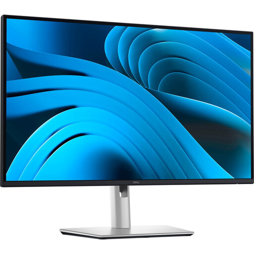
The Pro Plus P2725DE is a QHD option for a workspace with multiple windows and a USB-C hub.
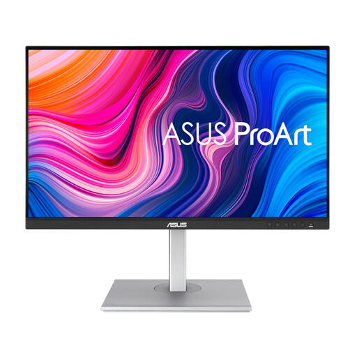
The ProArt PA278CV is a QHD option for anyone who also assesses interface colours.
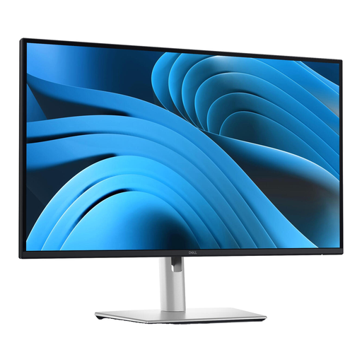
The PD2705Q is a QHD design monitor with stated sRGB coverage.
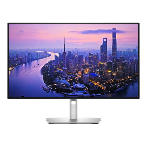
The UltraFine 27UP850K-W offers a 27-inch 4K option for anyone who also works with detailed images.
The 27E1N1300A/01 is a Full HD option with USB-C for a simpler window layout.
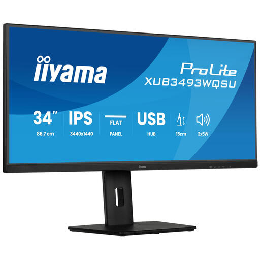
This selection includes QHD, 4K and ultrawide screens for working with multiple windows, visual work and different laptop set-ups.
 No image available
A 27-inch QHD screen suits work where you want to view code, booking steps and a browser preview side by side.
2560 × 1440 pixels. Dell lists a USB-C hub, 90 W over USB-C and 100 Hz for this model.
 No image available
This 27-inch QHD model suits a workspace where you use several windows side by side.
2560 × 1440 pixels.
 No image available
A 27-inch 4K screen is an option if you also view or edit high-resolution images alongside your web development work.
3840 × 2160 pixels.
 No image available
An ultrawide screen may suit a workspace where you want to keep several windows open at once.
34 inches, IPS, ultrawide, with PiP, PBP and a height-adjustable stand.
 No image available
This QHD monitor is an option if you also assess interface colours and visual elements while building.
2560 × 1440 pixels. ASUS specifies 100% sRGB and 65 W USB-C power delivery for this model; check that it’s enough for your laptop.
No. You can check the layout using a custom browser viewport, but Chrome describes device simulation as an approximation. If in doubt, test it on a real mobile device too.
Check whether your laptop supports video over the connection you plan to use, and compare its power requirements with the monitor’s specifications. ASUS lists 65 W for the PA278CV; Dell lists 90 W for the P2725DE.
Adjust its position and lighting to suit you, and avoid bothersome reflections. Arboportaal outlines additional workplace requirements for employees who work at a screen for more than 2 hours a day; speak to your employer about how these apply to your situation.
For a consumer purchase in the Netherlands, the seller must put things right at no cost if a product fails to meet what you could reasonably expect under normal use, as ACM ConsuWijzer explains. Online consumer purchases generally come with a cooling-off period of up to 14 days after delivery; check which exceptions apply to your order. These consumer rules do not necessarily apply in the same way to business purchases.