For digital text previews, the key considerations are a detailed display, a practical scaling setting and a workspace that’s easy to adjust. If you also assess colour-critical designs, look at colour modes and calibration. Check, too, that the connections are compatible with the laptops used at the shared workstation.
Who is this choice relevant to?
Digital typography reviewer
If you assess letterforms and text layout on screen, look for plenty of detail and a text size that’s comfortable to work with in your software. Microsoft Support explains how to adjust the scaling of text and apps in Windows.
Shared-desk user
If several people or laptops use the same workstation, an adjustable screen position and suitable connections are practical considerations. Arboportaal highlights height adjustment, avoiding reflections and appropriate lighting for display screen workstations.
Colour-critical designer
If you also assess typography for design or print, factor colour modes, profiles and any calibration into your workflow. ASUS and EIZO describe colour and calibration features for specific models; check that they suit the way you work.
What should you look for when choosing?
| Consideration |
What should you look for? |
Who is this most important for? |
| Sharpness and text size |
Compare resolution and screen size, and test your apps at a practical scaling setting. |
If I want to assess letterforms and text layout accurately, I need plenty of detail without making text awkwardly small. An estimated 34% of consumers put sharpness first. |
| Adjustability and reflections |
Check the height adjustment and desk space, and assess reflections in the actual workspace. |
At a desk used by different people, I want to adjust the screen easily to suit my position and minimise distracting reflections. An estimated 27% of consumers prioritise adapting the workspace. |
| Colour management |
Decide on the intended output and check the colour mode, profile workflow and calibration options. |
If typography is part of colour-critical design or print work, I want to know whether the monitor suits my colour management workflow. An estimated 20% of consumers put colour management first. |
| Connections |
For each laptop, compare its video output and charging requirements with the connections and USB-C specifications of the exact model. |
When different laptops are connected to the same monitor, I want to make sure the connection works with the computers we actually use. An estimated 19% of consumers prioritise laptop compatibility. |
Common mistakes
-
Assuming high resolution means the text will be the right size
You can adjust the size of text and apps separately. So a high resolution doesn’t automatically determine how large text appears on your desktop.
Before choosing based on resolution alone, test your preferred scaling setting in the typography apps you use.
-
Assuming USB-C will charge any laptop
The stated USB-C power delivery varies by model and won’t necessarily be enough for every laptop.
Compare each laptop’s charging requirements and video support with the specifications of the exact screen.
If the charging power isn’t sufficient, you may still need a separate laptop charger.
-
Assuming a stated colour gamut guarantees a print proof
A colour gamut or factory calibration alone doesn’t guarantee a match with a print. Profiles, settings and the calibration equipment required may also be part of the workflow.
Choose specialist colour features if you can configure and maintain them for your intended output.
You may need a suitable sensor or extra time for calibration and profiles.
Brands to consider
Philips
The Philips 27E1N1800AE/00 is a 27-inch 4K IPS monitor for text and general office work.
- Philips lists height adjustment for this model.
- The listed model specifications don’t confirm a USB-C connection or specialist hardware calibration.
BenQ
BenQ positions the PD2705U for design work, with 4K, an sRGB mode and USB-C.
- BenQ states that the model offers 99% sRGB coverage and 65 W USB-C power delivery.
- These are manufacturer specifications, not independent colour measurements. Check that the charging power is suitable for your laptop.
Dell
Dell combines a 27-inch 4K panel with hub features and an adjustable stand in the UltraSharp U2725QE.
- Dell lists IPS Black, 120 Hz and an ambient light sensor for this model.
- These extra features aren’t necessarily needed for typography. Weigh them against the connections and setup of your workspace.
ASUS
ASUS positions the ProArt PA279CRV for design work where colour gamut and USB-C power delivery matter.
- ASUS lists factory calibration, 99% DCI-P3 and 99% Adobe RGB for this model.
- Factory calibration doesn’t replace checking your own colour management workflow.
EIZO
The ColorEdge CS2740 is a 27-inch 4K model for work where repeatable colour settings matter.
- EIZO offers ColorNavigator 7 for calibration.
- Check that your sensor, operating system and software are supported. For digital text previews alone, this workflow may involve more than you need.
Monitors on Joybuy
Joybuy monitors for typography in a shared workspace, including 4K models for text and layout, with options for different screen sizes and connection requirements.
 Image unavailable
Dell UltraSharp U3226Q 32" 4K UHD 120Hz QD-OLED monitor
An option if you want to assess typography and layout on a 32-inch 4K UHD screen.
32 inches; 4K UHD; 120 Hz; QD-OLED.
View at Joybuy
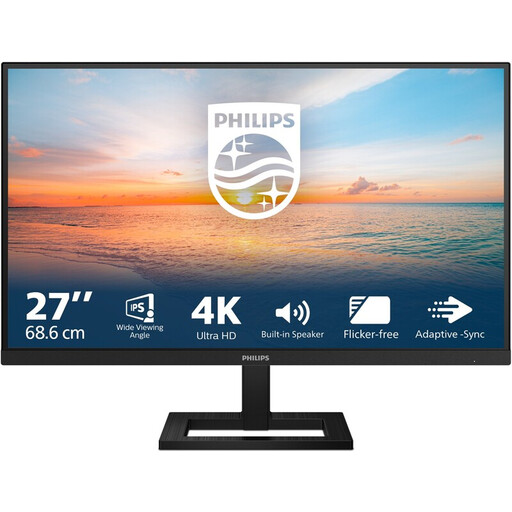 Image unavailable
Philips 27E1N1800AE/00 27-inch 4K UHD IPS monitor
A 27-inch option for anyone who wants to assess letterforms and text layout in detail.
4K UHD, 3840 × 2160, IPS, 60 Hz and 4 ms; HDMI, DisplayPort and height-adjustable stand.
View at Joybuy
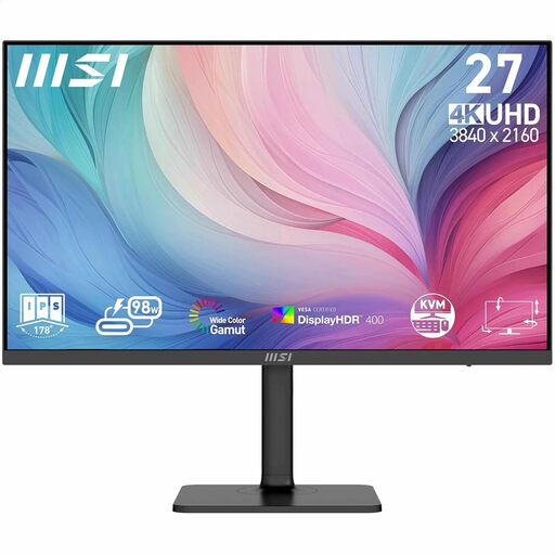 Image unavailable
MSI Modern MD272UPHG 27-inch 4K Ultra HD monitor
A 27-inch option if you want to view typography and layout in 4K.
27 inches; 3840 × 2160 pixels; 4K Ultra HD.
View at Joybuy
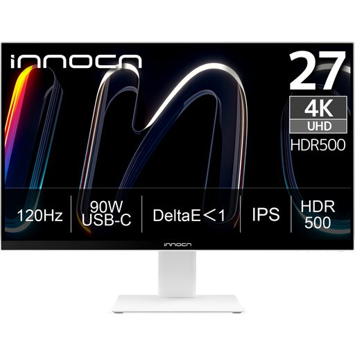 Image unavailable
INNOCN CB27U1 27-inch 4K UHD IPS monitor
An option for anyone who wants to assess typography in 4K and adjust the screen position at a shared workstation.
27 inches; 3840 × 2160; IPS; 120 Hz; USB-C with 90 W Power Delivery; height-adjustable.
View at Joybuy
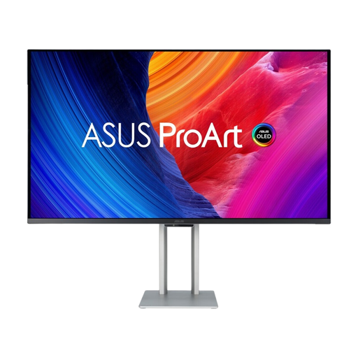 Image unavailable
ASUS ProArt OLED PA32UCDM 31.5-inch 4K Ultra HD QD-OLED monitor
A 31.5-inch option if you want to assess typography and layout in 4K on a larger screen.
31.5 inches; 3840 × 2160 pixels; 4K Ultra HD; QD-OLED.
View at Joybuy
Frequently asked questions
Does 4K automatically make text comfortable to read?
No. Resolution and display scaling are different settings. In Windows, you can adjust the scaling of text and apps. Test the display with the software you use.
How do you set up a monitor for different users?
Adjust the screen position for each user, and assess reflections and incoming light in the actual workspace. Arboportaal highlights height adjustment, avoiding reflections and appropriate lighting when setting up display screen workstations.
Is a calibrated monitor enough to assess a print proof?
Not on its own. The profile and calibration workflow also needs to suit the intended print preview. If you use calibration software, check that it supports your sensor and operating system.
Is there always exactly two years’ statutory warranty on a monitor in the Netherlands?
No. ACM ConsuWijzer explains that statutory warranty depends on what you could reasonably expect from the product under normal use. A separate manufacturer’s or seller’s warranty doesn’t limit that right. Also check which terms apply to the specific buyer and agreement.
Which workplace rules are relevant in a shared office in the Netherlands?
Arboportaal describes requirements for safe display screen work and workspace setup, including screen adjustment, reflections and lighting. How those rules apply to a particular working situation needs to be assessed separately; they aren’t general product specifications for every personal purchase.