
Designer working beside a bright window
You want to reduce reflections and glare while you draw. So, consider your screen position and window coverings alongside the screen’s features.


Start with where your screen is positioned. If you can look at it with the window to one side and reduce distracting light, tackle the problem at your workstation rather than relying on the monitor alone. Then choose a design monitor with colour features that suit your needs if colour accuracy matters, or compare 4K and QHD models for detail, screen space and connectivity. Manufacturer specifications alone won’t tell you how a screen performs beside your window.
You want to reduce reflections and glare while you draw. So, consider your screen position and window coverings alongside the screen’s features.
You assess map colours for a particular digital destination or for print, and want to compare suitable colour modes and, where necessary, calibration options.
You use small labels, a canvas and tool panels at the same time, possibly from a laptop. Resolution, adjustability and connectivity may all be important.
Suitable if: you assess map colours for a particular digital or print destination.
Bear in mind: a colour mode or calibration feature doesn’t tell you how the screen will look at your workstation.
Suitable if: you want to view fine map lines, labels and work panels together without needing a specialist colour workflow.
Bear in mind: check that text remains easy to read at the scaling setting you use.
Suitable if: adjustability and a smooth desktop experience matter more to you than the extra pixels of 4K.
Bear in mind: QHD has fewer pixels than 4K at the same screen size, so check small map labels from the distance you plan to work at.
| Consideration | What to look for | Who is it most important for? |
|---|---|---|
| Visibility beside a window | Compare the anti-glare finish and stated brightness, but also consider whether you can position the screen well and shield it from the window. | If light falls on my screen, I want to be able to see map lines and dark areas clearly. Around 36% of consumers put visibility first. |
| Colour assessment | Check that the colour modes suit the destination for your map and whether your workflow requires calibration. | For maps intended for a particular digital destination or for print, I want to assess colours that suit the output. Around 29% of consumers put colour consistency first. |
| Detail and workspace | Compare screen size and resolution, and assess labels using your usual scaling setting and viewing distance. | When I need to see the canvas, labels and tool panels together, I want enough workspace and details that are easy to read. Around 21% of consumers value detail and workspace most. |
| Connectivity and positioning | Check the laptop port, video signal, charging requirements and cable separately; compare the stand’s adjustment options too. | If I connect my laptop or regularly change my screen position, I want to know whether the connection and setup will suit my workstation. Around 14% of consumers put connectivity and positioning first. |
A stated typical brightness describes a screen specification, not the amount of light falling on your desk.
First, assess the direction of the screen and your window coverings. Then compare the anti-glare finish and stated brightness of the exact model.
The right colour mode depends on the destination for your map. A coverage percentage alone doesn’t tell you whether the colours will be accurate for your workflow.
First, decide on the intended end result. Then check the exact model’s colour modes and any calibration options.
Both the laptop and the monitor connection need to support the video signal and provide enough power.
Check the laptop port, monitor port, required charging capacity and cable separately.
You may need a different connection or a suitable cable.
The ProArt PA279CRV is worth considering if you want to compare an anti-glare screen with dedicated colour modes.
The Creative Pro PD2732U is an option to compare if your workflow includes both digital files and print.
The UltraFine 27UP850K-W is an all-round 27-inch 4K option for detailed work, with an adjustable stand.
The UltraSharp U2724D is worth considering if you’re looking at an adjustable 27-inch QHD monitor with 120 Hz instead of 4K.
The ColorEdge CS2740 is worth considering if colour modes and hardware calibration are part of your workflow.
These monitors are suited to detailed map work, with options for an all-round 4K workstation and workflows that involve colour assessment.
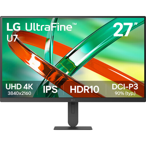 No image available
An option to compare if you want to view map details and several design panels on a 4K screen.
27 inches; 4K; IPS.
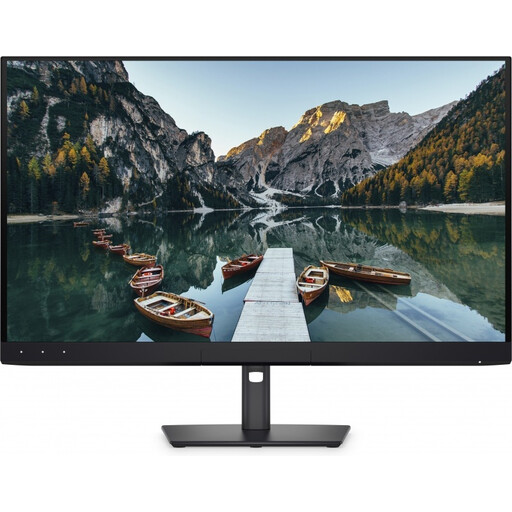 No image available
Compare this larger 4K screen if you want to weigh up your map workspace against the amount of desk space you have.
32 inches; 4K UHD; 120 Hz; QD-OLED.
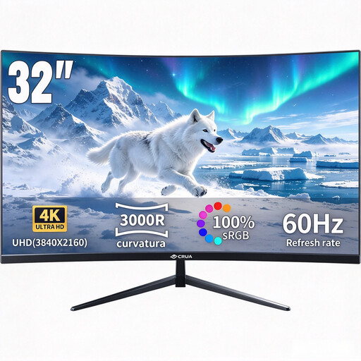 No image available
An option to compare if you’re considering a larger curved screen for your map canvas.
32 inches; 3000R curvature; VA display; UHD 3840 × 2160; HDR10; 100% sRGB colour coverage.
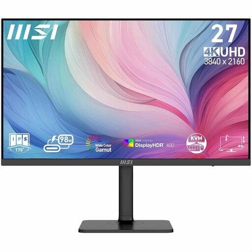 No image available
A model to compare if you combine detailed map work with a workflow that involves colour assessment; check which colour features suit your needs.
27 inches; 3840 × 2160 pixels; 4K Ultra HD.
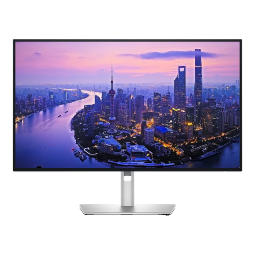 No image available
An option to compare if you’re looking for a 27-inch 4K screen for fine map details and want to consider distracting reflections.
27 inches; 3840 × 2160 pixels; 4K Ultra HD; LCD.
If the window causes reflections or glare, Arboportaal advises positioning yourself so that you look parallel to the window. Moving further away from the window or using suitable window coverings may also help. This advice doesn’t prove that a particular monitor model can handle direct sunlight.
That depends on the laptop port, cable and power required for charging. ASUS lists USB-C with DisplayPort Alt Mode and 96 W Power Delivery for the PA279CRV. Check that your laptop can output video through that port and that the power delivery meets your charging needs.
Choose a colour mode that suits your intended end result and assess colours without distracting daylight falling on the screen. According to ASUS, the PA279CRV includes sRGB and Adobe RGB modes, among others; EIZO lists hardware calibration for the CS2740. These are model-specific features, not a guarantee that the image will match every other screen or print.
No. According to the Dutch government, there is no fixed term for the statutory guarantee in the Netherlands: you’re entitled to a product that works as it should, depending on what you could reasonably expect. If there’s a problem, contact the retailer; a manufacturer’s warranty is an additional benefit.
According to the Dutch government, the old-for-new scheme applies to household equipment when you buy a similar item, including online purchases. The shop can’t charge you to take the old item back; if your new purchase is delivered, there are additional ways to arrange collection.