
Layout designer working with lots of footnotes
If you regularly switch between page layouts, sources and maps, small details and usable screen space matter. RTINGS.com notes that high resolution is important for displaying fine detail.


For small footnotes, map labels and source references, resolution and usable workspace are key considerations. If you’re preparing colour-critical work for print, the right colour profile and calibration method matter too. Also check that the size, adjustability and connections suit your computer and workspace: a monitor’s colour gamut rating alone doesn’t guarantee a match with the final print.
If you regularly switch between page layouts, sources and maps, small details and usable screen space matter. RTINGS.com notes that high resolution is important for displaying fine detail.
When assessing heritage photographs for a printed publication, pay particular attention to colour gamut, colour profiles and calibration. Adobe explains that the profile for a printer and paper combination determines which colours that combination can print.
If you regularly connect a laptop and spend long periods working on layouts, suitable connections and an adjustable screen position are important. For employees in the Netherlands, Arboportaal also explains the importance of alternating screen work with other tasks or a break.
A good fit if: you mainly check footnotes, captions, maps and pages for detail.
The trade-off: a stated sRGB coverage figure alone doesn’t prove that a print proof will look as intended.
A good fit if: you assess photographs for print yourself and work with the appropriate output profiles.
The trade-off: also check what measuring equipment and process are needed for calibration.
A good fit if: you regularly connect your laptop and want to adjust the screen to suit your workspace.
The trade-off: check whether your laptop supports video through the chosen port and how much charging power it needs.
| What to consider | What to look for when buying | Who it matters most to |
|---|---|---|
| Small text and map details | Compare resolution and screen size, and view a sample page at your preferred display scale. RTINGS.com highlights the importance of high resolution for displaying detail. | If I want to check footnotes and map labels closely, I look for readability as well as space for my work windows. Around 36% of consumers put checking fine detail first. |
| Colour for a printed publication | Ask the printer which profile is right for the intended process, and compare the colour gamut specification and calibration method. Adobe explains that printer and paper combinations each have their own output profile. | If I’m assessing heritage images for print, I want to know how the screen and output profile fit together in my workflow. Around 29% of consumers prioritise colour assessment for print. |
| Connections and positioning | Check your laptop’s video output, the charging power required, the cables and how adjustable the stand is. | If I connect my laptop often and spend long periods working on layouts, I want a suitable connection and a screen position I can adjust. Around 21% of consumers prioritise laptop connectivity and workspace adjustment. |
| Matching features to how you work | Decide whether your final version will be digital, printed or both, and which features you actually need; compare warranty terms separately. | If I mainly publish digitally, I don’t want to choose features I won’t use, but I still want to allow for a potential print workflow. Around 14% of consumers give this consideration priority. |
The final colour reproduction also depends on the profile for the printer and paper combination being used. So a monitor’s colour gamut percentage alone doesn’t tell you how the booklet will look in print.
Ask for the output profile and assess colours as part of your intended workflow, for example by using an appropriate soft proof.
Allow extra time for profiling, proof prints and any corrections that may be needed.
A monitor may support a specific video signal and maximum charging power, but that doesn’t mean every laptop will work through that port or receive enough charge.
Compare your laptop’s video output and charging requirements with the specifications of the exact screen you’re considering.
Check whether you’ll need a different cable or a separate power solution to connect it.
ACM ConsuWijzer distinguishes between statutory guarantees and any additional terms or periods offered by a manufacturer or seller.
Keep your proof of purchase and, if a fault develops, contact the seller about your applicable statutory rights.
BenQ describes the PD2705U as a 27-inch 4K screen with sRGB for design work; the separate SW272U is aimed at photographic colour work.
The ColorEdge CS2740 is worth considering if colour-critical image editing and hardware calibration are part of your workflow.
According to the Dutch product specifications, the ProArt PA279CRV is a 27-inch 4K screen with an Adobe RGB mode and USB-C.
According to LG, the 27UP850K-W combines a 27-inch 4K screen with USB-C and an adjustable stand.
The UltraSharp U2723QE is an example of a 27-inch 4K alternative with hub connections.
These Joybuy products are suited to detailed layout work, with options that also let you consider connections, adjustability and colour work.
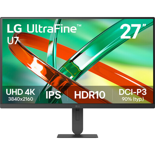 No image available
The 27-inch 4K screen is well suited to checking small text and details in a page layout.
27 inch, 4K and IPS.
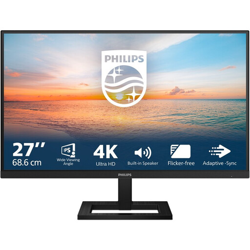 No image available
The 27-inch 4K resolution is ideal for closely checking footnotes and map details.
27 inch, 4K UHD IPS, 3840 × 2160, 60Hz and 4ms; HDMI, DisplayPort and height-adjustable stand.
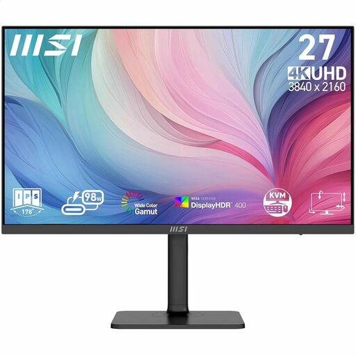 No image available
This 27-inch 4K model is suited to detailed layout work; its stated adjustability and USB-C connection are useful for a laptop workspace.
27 inch, 3840 × 2160 pixels and 4K Ultra HD.
The stated Adobe RGB coverage alone doesn’t guarantee a match with a print; the profile for the printer and paper combination still matters.
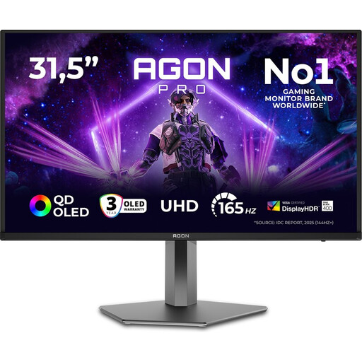 No image available
The stated 32-inch 4K resolution is useful if you want to view details and page layouts on a larger screen.
32 inch, 4K Ultra HD, 165Hz and OLED.
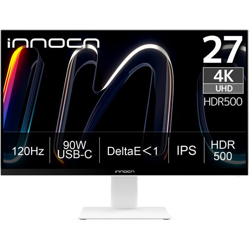 No image available
This 27-inch 4K model is suited to checking fine detail; its stated Adobe RGB coverage may be useful if you’re preparing colour-critical work for print.
3840 × 2160 IPS, 120Hz, HDR500, FreeSync, PIP and PBP; USB-C 90W PD, HDMI and DisplayPort; height-adjustable.
The stated Adobe RGB coverage alone doesn’t guarantee a match with a print; the profile for the printer and paper combination still matters.
No, not automatically. First, establish the print process and the colour profile that goes with it. Adobe explains that the profile for a printer and paper combination determines which colours it can print; a wider colour gamut doesn’t replace that profile.
Use the profile for the intended output and, where appropriate, soft-proof your work. Adobe describes soft proofing as a preview on your monitor using colour profiles. The result still depends on your chosen workflow and doesn’t guarantee that every print will look identical.
Adjust your screen and workspace to suit you, and minimise distracting reflections. For employees in the Netherlands, Arboportaal also advises alternating screen work with other tasks or a break at regular intervals, in line with the applicable workplace requirements.
According to ACM ConsuWijzer, online consumer purchases often come with a statutory cooling-off period of up to 14 days after delivery, although exceptions apply. The statutory guarantee is separate from any manufacturer’s warranty; if a product is faulty, the seller is responsible for providing a solution under the applicable terms.