
Student getting a poster printed
Wants to assess photos, illustrations and colours without mistaking what appears on screen for a guaranteed print proof. Adobe describes colour profiles as part of colour management for documents.


For designing and digitally reviewing a community poster, a monitor with a stated sRGB coverage is a practical starting point. If you regularly work on colour-critical print projects, calibration, document profiles and a printed proof matter too. Then compare the screen space and resolution with the way you work, and check that the monitor’s connections are compatible with your laptop.
Wants to assess photos, illustrations and colours without mistaking what appears on screen for a guaranteed print proof. Adobe describes colour profiles as part of colour management for documents.
Wants a clear view of the poster, text and design tools, so compares screen size with resolution. BenQ and LG list the screen sizes and resolutions of the models mentioned, which you can compare with your workspace.
Wants to check that the monitor can provide the video connection and, if needed, power required by their laptop. Connections vary by model; ASUS and BenQ list these for the models mentioned.
Start with your intended result: digital assessment, a well-organised workspace and regular colour-critical print work each call for different checks.
| What to consider | What should you check? | Who is this most important for? |
|---|---|---|
| Colour for print | Check the stated colour gamut of the exact model and ask the printer about the output profile and proofing process. | I want to know how the poster will be assessed for print, not just how it looks on my screen. Around 31% of consumers put colour assessment for print first. |
| Workspace and detail | Compare the screen size and resolution with your desk space and your computer’s display scaling. | If I want to view text, images and the overall design alongside my design tools, my workspace layout matters too. Around 25% of consumers make workspace their top priority. |
| Use and additional tools | Check the energy label for the exact model and decide whether your workflow calls for additional calibration or a printed proof. | I want to choose the features I need for this project and plan ahead for the steps and tools involved in my workflow. Around 25% of consumers prioritise how they will use the monitor and what extras they need. |
| Laptop connection | Check the video signal, charging power and cable for both the laptop and the exact monitor model. | If I want to connect my laptop directly, the connection needs to support the capabilities of both devices. Around 19% of consumers start by checking the laptop connection. |
A stated colour gamut describes a screen feature, but it doesn’t determine how a file will be assessed using the printer’s output profile.
Ask the printer which profile and proofing process you need. Treat sRGB, DCI-P3 and Adobe RGB as different colour spaces, not interchangeable percentages.
Having a port on both devices doesn’t prove that your chosen cable will carry video or that the monitor will provide enough power for your laptop.
Check the port capabilities, required charging power and cable for your laptop and the exact monitor model. Allow for a possible adapter or separate power supply if your setup requires one.
According to the Dutch government, there is no fixed period for the statutory guarantee in the Netherlands; a manufacturer’s warranty does not replace your rights if a product is faulty.
Keep your proof of purchase and report any fault to the retailer. Treat the manufacturer’s warranty as additional information, not as the only measure of your rights.
The DesignVue PD2705Q is a QHD example for anyone comparing stated sRGB coverage and laptop connectivity.
The ProArt PA278CV is a QHD model with stated sRGB coverage and USB-C; check the full model code.
The 27UP850K-W is a 27-inch 4K example for anyone who values finer screen detail.
The ColorEdge CS2740 is worth comparing if you also regularly work on colour-critical print projects.
This selection includes QHD, 4K and ultrawide monitors. Compare the stated resolution, colour gamut and connections with your desk space and poster workflow.
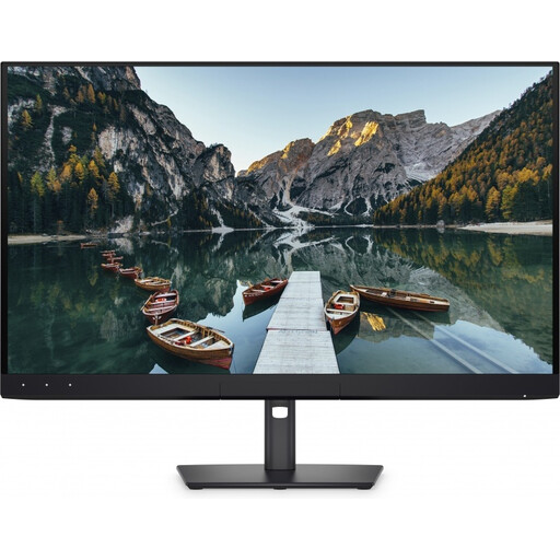 No image available
A good fit for anyone considering a 4K screen for detailed poster layouts and colour-focused work.
The product name lists 32 inches, 4K UHD, 120Hz and QD-OLED. The product description lists 100% sRGB, 94% Adobe RGB and an integrated automatic colourimeter.
Colour gamut coverage and calibration features alone don’t guarantee a match with the print; document profiles and a possible printed proof still matter.
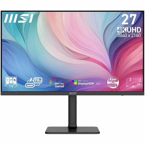 No image available
An option to compare if you’re looking for a 27-inch 4K screen with colour features for design work.
The product description lists 27 inches, 3840 × 2160 pixels, factory calibration, 97% DCI-P3, 94% Adobe RGB and USB-C with 98 W Power Delivery.
The stated colour gamut coverage and factory calibration don’t guarantee a match with the print; document profiles and a possible printed proof still matter.
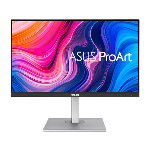 No image available
A good fit if you’re comparing a QHD screen with stated sRGB coverage for poster design.
This model is listed as having 27 inches, 2560 × 1440 pixels, 100% sRGB and factory calibration. ASUS also lists USB-C with 65 W power delivery for the PA278CV.
The stated sRGB coverage and factory calibration don’t guarantee a match with the print; document profiles and a possible printed proof still matter.
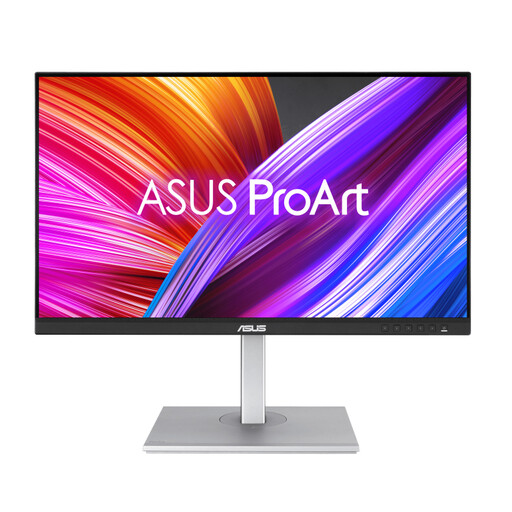 No image available
A QHD model to consider if you combine poster design with colour-focused design work.
The product description lists 27 inches, 2560 × 1440 pixels, 100% sRGB, 95% DCI-P3 and USB-C with 90 W Power Delivery.
The stated colour gamut coverage and factory calibration don’t guarantee a match with the print; document profiles and a possible printed proof still matter.
 No image available
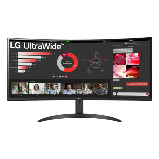
A good fit if you want to place several windows side by side while designing a poster and are considering an ultrawide screen.
The product description lists 34 inches, 3440 × 1440 pixels, 21:9 and 99% sRGB. Picture-by-Picture for two devices is also mentioned.
The stated sRGB coverage doesn’t guarantee a match with the print; document profiles and a possible printed proof still matter.
No, don’t assume that it will. For colour-critical posters, use the document and output profiles requested by the printer and discuss how a proof will be assessed. Colour management involves more than just the monitor.
Start by checking the stated resolution of the exact model, then check the selected colour mode and profile in your document workflow. If accurate colour matters, decide how the monitor will be calibrated; factory calibration doesn’t measure your current setup.
When you buy at a distance, the retailer must tell you about the cooling-off period, which is usually 14 days according to the Dutch government. If a product is faulty, the Dutch statutory guarantee also applies: there is no fixed statutory period, and the retailer must provide a solution. A manufacturer’s warranty is an additional benefit.
Check the energy label for the exact model; European ecodesign and energy-labelling rules cover electronic displays. According to the Dutch government, you can return an old monitor in several ways, including when buying a similar device, at a collection point or at your local council recycling centre.