
Designer working with fine poster details
You want to assess small text, illustration details and references. Screen resolution and usable workspace are therefore important factors in your choice.


For small text, illustrations and references, a sharp display with enough workspace is important. For colour-critical print work, you’ll also need a suitable colour gamut and a well-managed colour workflow. Then compare the connections, power delivery and adjustability with your computer and workspace. Manufacturer specifications alone can’t guarantee that a print will match what you see on screen.
You want to assess small text, illustration details and references. Screen resolution and usable workspace are therefore important factors in your choice.
You assess colours for a poster that will be printed and want to know whether a wider colour gamut and calibration suit your print workflow.
You switch between the poster file and references, and consider the connections, power delivery and screen positioning.
A good fit if: you mainly assess text, illustrations and references, and don’t need a specific Adobe RGB workflow. BenQ lists the PD2705U as a 27-inch monitor with 3840 × 2160 pixels, 99% sRGB and USB-C with 65 W power delivery.
Keep in mind: the stated sRGB coverage doesn’t indicate Adobe RGB coverage or a match with a specific printing press. Also check whether 65 W is enough for your laptop.
A good fit if: you also assess saturated colours for print and work with suitable colour profiles and calibration. ASUS lists 99% Adobe RGB for the PA279CRV; EIZO lists more than 99% Adobe RGB for the CS2740, along with hardware calibration using ColorNavigator.
Keep in mind: a stated colour space or factory calibration doesn’t guarantee an identical print. Set up your workflow to suit the print profile and viewing conditions.
A good fit if: you value an adjustable screen setup or USB-C. LG lists an adjustable arm with a C-clamp and USB-C with 60 W for the 27UN880P-B; Dell lists up to 90 W power delivery for the U2725QE.
Keep in mind: check that your desk can accommodate the C-clamp and that the connection you choose works with your computer. Workspace features don’t prove that a monitor is suitable for colour-critical proofing.
| What to consider | What should you look for? | Who is this important for? |
|---|---|---|
| Fine details | Compare the resolution and screen size of the exact model; use your own computer to check whether the preferred display scaling feels comfortable. | If I want to examine small text and illustrations closely, I prioritise design sharpness. Around 36% of consumers put assessing poster details first. |
| Print colours | Ask which colour profile is required for the print job, then compare it with the model’s colour gamut and calibration options. | When I need to assess the colours of a printed poster, I want to know whether the screen and print workflow work well together. Around 29% of consumers make print colour their top priority. |
| References alongside the design | Try out the layout of your design software and references, taking screen size, resolution and available desk space into account. | If I want to view the poster file and references at the same time, I look for a layout that suits my workspace. Around 21% of consumers prioritise having references side by side. |
| Laptop and workspace | Check video support, the power needed and the cable included; if you’re using a C-clamp, check your desk too. | When I want to connect my laptop to the screen and adjust the setup, the connection and positioning need to suit my workspace. Around 14% of consumers prioritise a laptop setup. |
A colour gamut or factory calibration doesn’t, by itself, tell you whether a print will match the screen. Screen calibration and your print workflow also matter.
Start by defining your output and the colour profiles you’ll use. Choose a wider colour gamut when there’s a specific reason for it in your workflow.
Colour management can take extra time; Adobe recommends a colorimeter for objective screen calibration.
USB-C on a monitor doesn’t automatically mean that every laptop can output video or receive enough power.
Compare your laptop’s video support and power requirements with the connections and stated charging capacity of the exact monitor.
According to the Dutch government, the Netherlands has no fixed statutory guarantee period. If a product is faulty, the retailer is your point of contact.
Keep your proof of purchase and distinguish between your statutory rights and any additional manufacturer’s warranty.
The PD2705U is a model worth considering for a 27-inch 4K design setup with sRGB and USB-C.
The ProArt PA279CRV is a 4K model to compare if Adobe RGB is part of your colour workflow.
The ColorEdge CS2740 is worth comparing if colour management is part of your graphics workflow.
The UltraSharp U2725QE is a 27-inch 4K model to consider if hub features matter for your workspace.
The 27UN880P-B is worth considering if you’re looking for a 4K screen with an adjustable arm and space for references.
This Joybuy selection includes monitors suited to poster design. Compare the stated screen size and resolution with your design software and workspace; a panel or resolution specification doesn’t guarantee that screen colours will match your print.
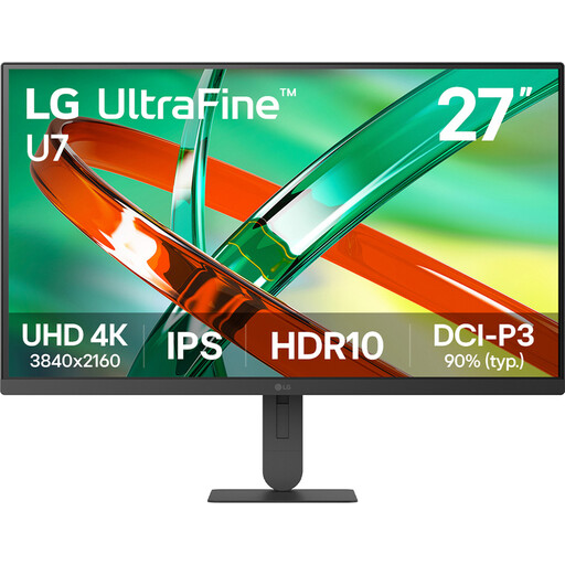 No image available
An option to compare if you’re looking for a 27-inch 4K monitor for poster design.
27 inch; 4K; IPS.
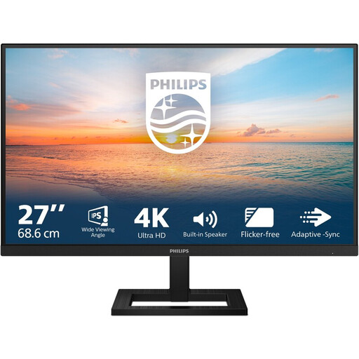 No image available
An option to compare if you’re looking for a monitor with a stated 4K UHD resolution for poster design.
27 inch; 4K UHD; IPS; 3840 × 2160; tilt-adjustable stand.
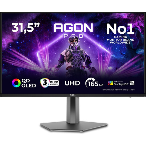 No image available
An option to compare if you’re considering a 32-inch 4K screen; the product name identifies this model as a gaming monitor.
32 inch; 4K Ultra HD; OLED; 165 Hz.
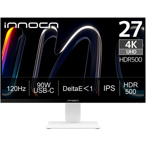 No image available
An option to compare if you’re looking for a 27-inch 4K screen for detailed poster design.
27 inch; 4K UHD; 3840 × 2160; IPS; 120 Hz.
A stated colour space or DeltaE specification doesn’t guarantee that a print will match the screen.
 No image available
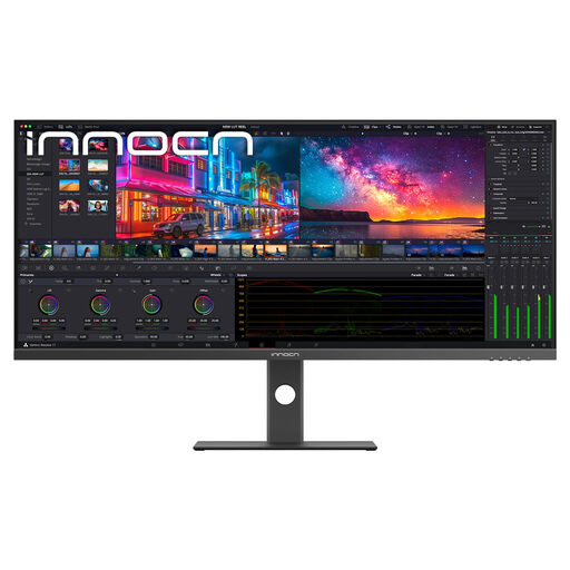
An option to compare if you’re considering an ultrawide screen for your poster file and other windows.
40 inch; 5120 × 2160; IPS; 100 Hz; 21:9 aspect ratio.
It depends on your output and colour workflow. sRGB coverage can be relevant when assessing design work. For print work where you need to assess colours outside that space, also compare the required colour gamut and calibration options. A coverage percentage alone doesn’t predict what the print will look like.
For objective colour accuracy, Adobe recommends using a colorimeter. Also consider the ambient light: a factory calibration report doesn’t automatically describe the conditions in your workspace.
Not without checking compatibility. Compare your laptop’s video support and power requirements with the input and stated charging capacity of the exact monitor; the models listed have different power ratings.
According to the Dutch government, you’re entitled to a product that works properly, and the Netherlands has no fixed statutory guarantee period. If a product is faulty, the retailer is your point of contact. A manufacturer’s warranty may provide additional rights, but it doesn’t replace your statutory rights.
For eligible distance purchases from a business, the Dutch government says that in many cases you have a 14-day cooling-off period. Check the seller and the terms of the specific purchase; there are exceptions to the general rule.