Online portrait editor
You create portraits that are mainly viewed digitally and want to align your colour settings with your export settings. Adobe describes an sRGB workflow for online viewing.


For online portraits, a well-configured sRGB workflow is a sensible starting point. For prints, calibration, ambient light, paper and the complete print workflow all matter too. Adobe recommends sRGB for online viewing and identifies calibration, working light and paper as part of a predictable print workflow. Also check that the exact monitor offers the screen positioning and connections that suit your workspace.
You create portraits that are mainly viewed digitally and want to align your colour settings with your export settings. Adobe describes an sRGB workflow for online viewing.
You want to print portraits and are looking for a monitor that fits into a calibrated workflow, with working light and paper taken into account. Adobe lists these factors alongside the colour management system.
You regularly review portraits in portrait orientation and want to consider screen positioning and detail alongside colour. LG and ASUS list pivot adjustment on the models discussed.
When: if your portrait will mainly be published digitally, start with a suitable sRGB mode or specification, then match your monitor profile and export settings to it.
Trade-off: a wider stated colour gamut does not replace the correct sRGB setting and export. Adobe recommends sRGB for online viewing.
When: if prints are an important end result, compare the monitor’s colour space and calibration options as part of your print workflow.
Trade-off: a stated Adobe RGB coverage figure alone cannot predict how well the screen and print will match; Adobe also highlights working light and paper.
| Consideration | What should you check? | Which consumers is this relevant to? |
|---|---|---|
| Colour for online publishing | Check the sRGB mode or specification for the exact model, then match your monitor profile and export settings to it. | If I mainly publish online, I want the colour settings to suit my digital output file. Around 36% of consumers prioritise a suitable online colour workflow. |
| Colour for printing | Compare the stated colour space and calibration options; also take working light, paper and colour management into account. | For portraits I want to print, I want to assess the monitor and print workflow together. Around 29% of consumers give print colour their highest priority. |
| Portrait-orientation images and detail | Check for pivot adjustment and height adjustment, and make sure details are easy to read at your chosen scaling setting. | If I regularly edit portraits in portrait orientation, I want the screen positioning and level of detail to suit my work. Around 21% of consumers prioritise reviewing vertical images. |
| Connecting and powering a laptop | Compare the video support offered by your laptop port, its power requirements and the cable specifications. | If I want to use my laptop through a single connection, that connection needs to support both video and power. Around 14% of consumers give laptop connectivity their highest priority. |
A stated colour percentage does not tell you whether the monitor profile, working light and output are well matched.
First decide whether you are editing for online viewing or print. Then check the relevant colour settings and calibration options.
Calibration may require extra time and equipment.
A monitor’s maximum charging power does not confirm that your laptop will output video through the same port or receive enough power.
Compare your laptop and monitor port specifications, and check that the cable supports the functions you need.
You may need a different compatible cable or a separate laptop power supply.
A product page can remain online even when that version is no longer available.
Before buying, check the availability of the exact model and version.
The SW272U is an option to compare for colour-critical portrait editing and work in portrait orientation.
The ColorEdge CS2740 is worth comparing if a calibrated print workflow is a priority.
According to ASUS, the ProArt PA279CRV combines several stated colour spaces with an adjustable workspace.
The 27UP850K-W is a useful comparison point for 4K detail, portrait orientation and USB-C in a mixed workflow.
The UltraSharp U2723QE is a useful comparison point for a 4K hub monitor with stated sRGB coverage.
Joybuy monitors for portrait editing, with resolution, colour coverage, pivot adjustment and laptop connectivity in mind.
 No image available
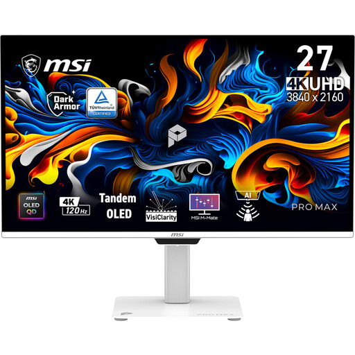
An option to compare if you value both detail and colour space when editing portraits.
26.5 inches, 3840 × 2160 and 120 Hz; the panel is OLED.
The product description lists 97.5% Adobe RGB, 99% DCI-P3, pivot adjustment and USB-C power delivery up to 98 W.
The product description warns that displaying static images for long periods may cause image retention.
 No image available
An option to compare if you want to consider detail and a calibration feature for portrait editing.
The product description lists 3840 × 2160, 120 Hz and a QD-OLED panel.
Listed specifications include 100% sRGB, 94% Adobe RGB, automatic calibration and a stand with 90° pivot.
 No image available
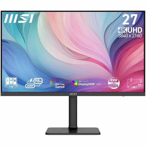
An option to compare if you want to consider 4K detail and stated colour spaces when editing images.
The product description lists 3840 × 2160, 94% Adobe RGB and 97% DCI-P3.
It also lists factory calibration, USB-C with DP Alt Mode and power delivery up to 98 W, plus a stand with height, tilt and swivel adjustment.
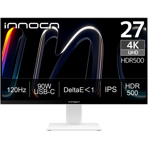 No image available
An option to compare if you edit online portraits or regularly review images in portrait orientation.
The specifications list 3840 × 2160, 120 Hz, 100% sRGB, 99% Adobe RGB and DeltaE < 1.
Also listed are 90° pivot, height adjustment and USB-C power delivery up to 90 W.
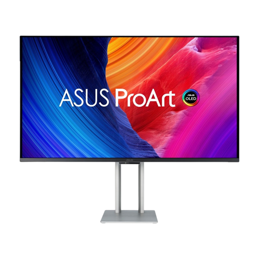 No image available
An option to compare if a 4K screen with a QD-OLED panel suits your editing workflow.
The product description lists 3840 × 2160, VESA mounting and height adjustment of up to 13 cm.
The product description warns of a risk of burn-in with the QD-OLED panel.
No. Match your monitor and document settings to the intended output. Adobe describes an sRGB workflow for online viewing; a wider stated colour gamut does not replace a suitable profile and correct export settings.
Calibrate and profile your monitor for colour-critical work. Adobe recommends recalibrating if you change relevant display settings and also identifies significant changes to your working light as a reason to do so.
No. That percentage is a stated feature of specific models. Adobe also identifies calibration, ambient light and paper as part of a predictable print workflow.
No. According to the Dutch Government, the Netherlands has no fixed statutory guarantee period: you are entitled to a product that works as it should, and this depends in part on what you could reasonably expect from the product. A manufacturer’s guarantee is an additional benefit; if something goes wrong, contact the retailer. This applies to consumer purchases, but not necessarily to business purchases.
Yes. According to the European Commission, computer monitors are covered by the energy labelling and ecodesign rules for electronic displays. Check the product information for the specific model; an energy rating says nothing about colour accuracy.