
Designers reviewing portfolios together
You’re sitting around a table with other people and want the screen to work well from different positions. So pay attention to viewing angles, reflections and whether the screen can be rotated.


Start by checking whether everyone can see the screen clearly from where they’re sitting. Then compare the resolution, size and reflections against the details you’ll be discussing. For digital portfolios, choosing the right colour profile matters more than simply having a large stated colour gamut. For print, calibration, ambient light and your print workflow also matter. USB-C is most useful when your laptop can output video through that connection and the power delivery is sufficient.
You’re sitting around a table with other people and want the screen to work well from different positions. So pay attention to viewing angles, reflections and whether the screen can be rotated.
You mainly review screen designs, photographs and typography, and want to inspect details using the right colour profile. Adobe emphasises that calibrating a monitor alone doesn’t guarantee accurate colour reproduction; your chosen workflow matters too.
You compare what you see on screen with the intended print. As Adobe explains, this calls for more than just a monitor: a controlled colour and lighting workflow and the paper type you use are important too.
First, decide which seating positions and working situations you need to support. Then compare the image detail, laptop connections and any colour-management requirements that matter for your portfolios.
| What to consider | What to look for | Who is this important for? |
|---|---|---|
| Viewing together | Check the screen from the actual seating positions, and look at the viewing angle, reflections and stand adjustability. A stated viewing angle doesn’t mean colours will look identical from every seat. | When several of us are sitting around the table, I want to discuss the portfolio without everyone having to sit directly in front of the screen. Around 33% of consumers put viewing together at the top of their list. |
| Fine detail | Compare resolutions at the same screen size. According to ASUS, the PA278CV has a resolution of 2560 × 1440; according to BenQ, the PD2705U has a resolution of 3840 × 2160. | When I’m reviewing typography and image detail on a 27-inch screen, I want to know which resolution suits my preferred scaling. Around 27% of consumers give detail the highest priority. |
| Connecting a laptop | Check whether the laptop can output video over USB-C, and compare the required power delivery with the monitor’s output. ASUS lists 96 W for the PA279CRV; BenQ lists 65 W for the PD2705U. | When different laptops are used around the table, I want to know in advance whether each one can output video through the same connection and receive enough power. Around 20% of consumers cite laptop connections as their main consideration. |
| Colour for print | Check which colour space your workflow uses, and consider calibration, profile settings and lighting too. Adobe points out that monitor settings, ambient light and paper all affect how closely the screen compares with a print. | When I’m comparing screen colours with an intended print, I want to assess the whole colour workflow rather than just a gamut percentage. Around 20% of consumers give colour assessment for print the highest priority. |
Your monitor settings and active colour profile need to suit the task. A one-off calibration doesn’t guarantee accurate colours in every working environment or workflow.
Check the active profile and calibrate for the workspace and task you use the monitor for.
Profiling may require extra time or equipment.
The models reviewed list different power outputs, including 65 W and 96 W. USB-C alone doesn’t confirm that a laptop can output video or receive enough power.
Check video support and the power requirements of every laptop you plan to connect.
If the power supply is insufficient, you may still need a separate laptop charger.
A stated colour gamut doesn’t guarantee a match with the final print. Adobe also highlights the importance of calibration, ambient light and paper.
Assess the monitor as part of your complete print workflow, rather than relying on a single gamut percentage.
The PD2705U is a 27-inch model for digital design reviews.
The ProArt PA278CV and PA279CRV offer different resolutions and stated colour spaces.
The ColorEdge CS2740 is a 4K wide-gamut model to consider for a print-focused workflow.
The UltraSharp U2723QE is a 27-inch 4K hub monitor to compare if connections and adjustability matter to you.
The UltraFine 27UQ850V-W is a 27-inch 4K model to compare if contrast and USB-C connectivity matter to you.
These models are aimed at portfolio reviews where image detail and viewing together matter. Check that each model’s connections and colour workflow suit your setup.
 No image available
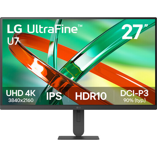
An option to compare if you want to discuss fine image detail while people view the screen from different seats.
27 inches, 4K and IPS according to the product name; the product description lists a 178° viewing angle.
 No image available
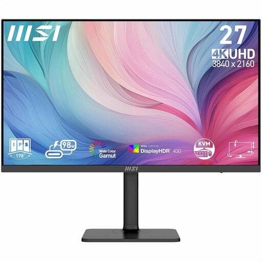
A model to compare if you’re looking for a 27-inch screen for portfolios with fine image and typography detail.
The product name lists 3840 × 2160 pixels and 4K Ultra HD.
 No image available
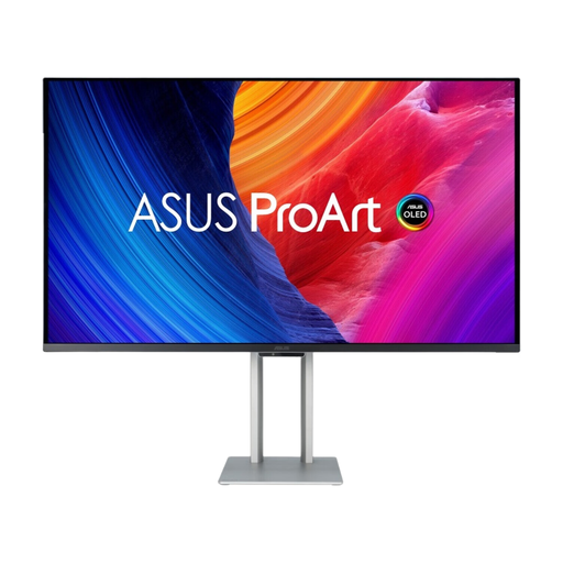
A larger screen to compare if several people around the table will be looking at details.
The product name lists 31.5 inches, 3840 × 2160 pixels, 4K Ultra HD and QD-OLED. The product description warns that the panel may be susceptible to burn-in.
 No image available
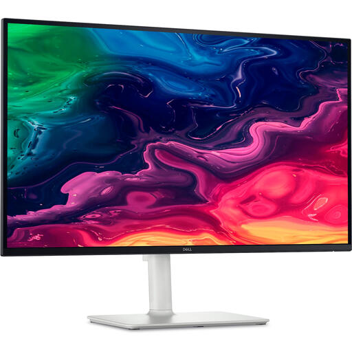
An option to compare if you’re looking for a 27-inch 4K screen for detailed work and viewing together.
The product name lists 3840 × 2160 pixels and 4K Ultra HD; the product description lists a 178° viewing angle.
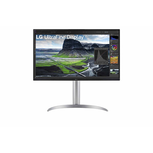 No image available
A model to compare if you want to discuss fine detail and connect a laptop over USB-C.
The product name lists 27 inches, 3840 × 2160 pixels and 4K Ultra HD. For this exact model, LG lists typical DCI-P3 coverage of 98% and 90 W USB-C power delivery.
No. First, find out which colour space your files will be reviewed in, then set up your monitor and operating system accordingly. A larger stated colour gamut doesn’t automatically mean a more accurate display.
Calibrate and profile the monitor for the workflow you’re using, and assess the screen and print under lighting that’s as consistent as possible. Adobe points out that ambient light and paper also affect how reliably you can compare them.
According to the Dutch government, the retailer is your point of contact for a remedy under the statutory guarantee. The Netherlands has no fixed statutory guarantee period; what you can expect depends, among other things, on the product and the purchase information. A manufacturer’s guarantee is separate.
According to the Dutch government, for many purchases made online from a business, consumers have 14 days to change their mind. This doesn’t apply to every transaction: check who the seller is and whether you’re buying as a consumer.
The European Commission states that computer monitors are covered by the energy label for electronic displays, with a scale from A to G. Compare the label and model information, including a separate HDR rating if one is available.