
Colour-critical design reviewer
You assess colours for a particular digital or printed output and want to know which colour space and colour-managed workflow are right for the job.


For evening reviews of industrial design, choose a monitor based on the output you’re working towards: a suitable sRGB or Rec.709 mode for on-screen work, extra resolution for fine drawings and text, or a colour-managed workflow if your output calls for it. Manufacturers’ colour coverage figures don’t guarantee that colours will match in your room or on paper. For evening use, also check the screen setup, reflections and your laptop’s connection options.
You assess colours for a particular digital or printed output and want to know which colour space and colour-managed workflow are right for the job.
You compare details across drawings, reference images and text, so resolution, screen space and readability are important.
You study at a desk for longer periods and want to position your screen properly, minimise reflections and connect your laptop easily.
Choose this option: if you mainly review digital designs and sRGB or Rec.709 settings matter to you.
The trade-off: stated colour coverage and calibration are based on manufacturer specifications; they don’t guarantee a match with every physical material sample or print proof. BenQ and ASUS each describe models with 99% and 100% coverage of sRGB and Rec.709 respectively.
Choose this option: if your files and output demonstrably require a colour-managed workflow, for example for print.
The trade-off: a wide gamut isn’t automatically necessary for sRGB-only material. EIZO’s guidance on Adobe RGB is manufacturer advice, not a requirement for every design student.
Choose this option: if you view fine details and accompanying text side by side, and don’t need a specific Adobe RGB workflow.
The trade-off: LG states a typical DCI-P3 coverage of 95% for the 27UP850K-W. That figure isn’t the same as sRGB coverage and doesn’t prove colour accuracy on its own.
First, decide which output and files you’ll be reviewing; then compare resolution, ergonomics and laptop connectivity. The percentages below show how much weight consumers give each need in this specific design review.
| Consideration | What to look for | Who will value this most? |
|---|---|---|
| Colour reproduction | Match the colour mode and calibration options to the colour space of your files and intended output. | If colour assessment for a defined digital or printed output is your priority, you’ll want to know whether the monitor suits that workflow. Around 28% of consumers name colour as their top purchase priority. |
| Drawing detail and readability | Compare native resolution at the same screen size, and check text size and scaling using your own files. | When you’re reviewing fine lines, reference images and text side by side, you’ll want to compare details clearly. Around 22% of consumers prioritise drawing detail. |
| Evening setup | Check height adjustment, reflections and positioning in relation to lights; also see whether the brightness can be adjusted. | If you spend longer reviewing work in the evening, an adjustable setup with minimal distracting reflections is important. Around 22% of consumers give evening comfort top priority. |
| Laptop connectivity | Check whether your laptop’s USB-C port supports video, and compare the power delivery required and cable requirements. | If you want to handle the display and, if needed, laptop power through a single connection, it must work with your laptop. Around 17% of consumers prioritise a single-cable connection. |
| Features that suit your work | First establish whether you need sRGB screen work, fine 4K detail or a colour-managed workflow. | If you mainly want to pay for features you need for your review work, it helps to decide on your end goal before looking at product specifications. Around 11% of consumers name spending on the right features as their top priority. |
Gamut coverage and colour accuracy aren’t the same thing. The colour space that’s useful depends on your files and intended output.
First check the colour space of the source file and output; then look at the colour modes and calibration options on the exact model.
Screen position, reflections and the lighting around your workspace also affect how practical your setup is. A night mode or blue-light claim doesn’t, on its own, prove a health benefit.
Compare the physical adjustment options and anti-glare features, and check the screen’s position in relation to your lights.
The PD2705U is designed for work where 4K and sRGB or Rec.709 modes matter.
The ProArt PA278CV is a colour-focused QHD option if 4K isn’t your first requirement.
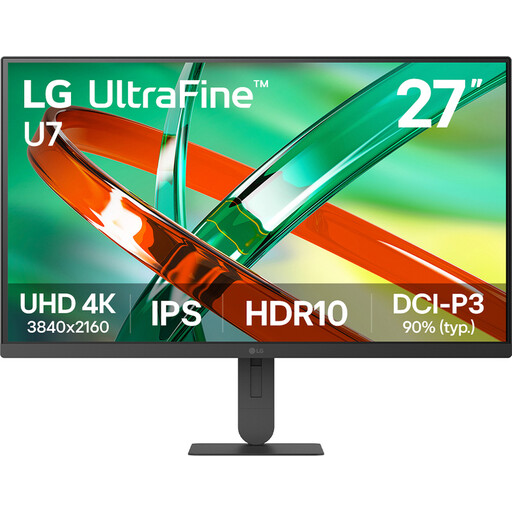
The UltraFine 27UP850K-W is a 27-inch 4K IPS model for detail-focused and mixed use.
The ColorEdge CS2740 is designed for graphics work where a wide colour gamut and colour management are relevant.
The UltraSharp U2725QE is a 27-inch 4K hub monitor to consider if connectivity and a versatile workspace matter to you.
These Joybuy monitors are suited to detail-focused design work and study, with features including 4K resolution and, on some models, an adjustable setup or USB-C.
 No image available
The stated 4K resolution and IPS panel are a good fit for reviews where image and drawing detail matter.
27 inches; 3840 × 2160 pixels; IPS panel. The product listing also mentions an anti-glare screen and a height-adjustable stand.
 No image available
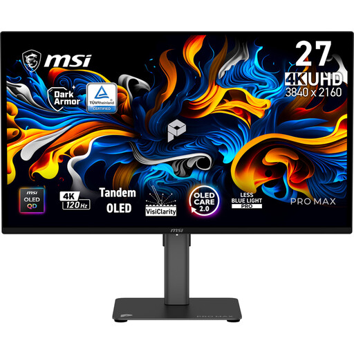
The stated 4K resolution suits you if you want to view fine drawings and text on a 27-inch screen.
27 inches; 3840 × 2160 pixels; QD-OLED panel; 120 Hz. The product description also mentions USB-C.
 No image available
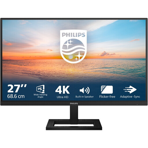
The product listing mentions 4K UHD and an adjustable stand—features to consider when reviewing details and adjusting your screen position.
27 inches; 3840 × 2160 pixels; IPS panel; 60 Hz; 4 ms. The description also mentions an anti-glare screen.
 No image available
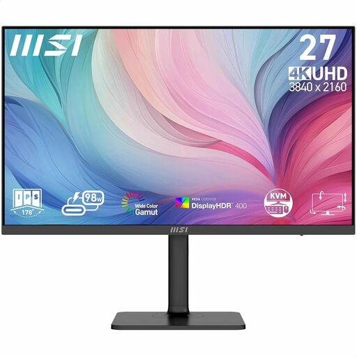
The product description positions this model for graphic design and lists features for a colour-managed workflow; assess them against your own files and output.
27 inches; 3840 × 2160 pixels. The description lists factory calibration, 97% DCI-P3, 94% Adobe RGB and an adjustable stand. These are product claims, not independent measurements.
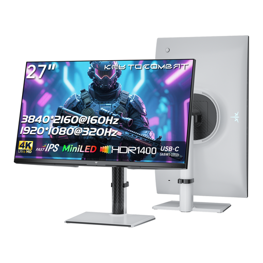 No image available
The stated 4K resolution is useful if you want to view fine drawings; also check that the connections and settings suit your review work.
27 inches; 4K UHD; Fast IPS panel with Mini-LED backlighting. The product listing mentions USB-C with 65 W Power Delivery, plus height, tilt and swivel adjustment.
No. First check the colour space of your files and intended output. Adobe RGB is mainly worth considering for a colour-critical workflow, such as print; for sRGB screen material only, a specified sRGB mode is a more logical first check. EIZO’s guidance on Adobe RGB is manufacturer advice.
Set the screen height and brightness to suit you, and avoid reflections from lights. Make sure the area around your workspace is lit too, rather than looking only at a bright screen in a dark room. Arboportaal’s guidance concerns employees’ workstations; that employment context doesn’t automatically apply to studying at home in your own time.
Only if your laptop’s USB-C port supports video, the power delivery is sufficient and you use a suitable cable. BenQ and ASUS each specify 65 W Power Delivery for the models described here; also check your own laptop’s requirements.
According to the Dutch government, a 14-day cooling-off period applies in many cases when you buy remotely in the Netherlands; check the terms and any exceptions that apply to your purchase. Your statutory guarantee is separate from the manufacturer’s warranty: if there’s a problem with the product, contact the seller.
Not simply because you study at home. Arboportaal sets out requirements for employees and their workstations, including conditions for more than two hours of screen work a day. If you also use the setup for your job as an employee, assess that employment context separately; for personal study, adjustability, lighting and minimising glare are practical considerations.