
Print image editor
You regularly assess reproductions and want to compare on-screen colours with the intended print output. Adobe describes colour profiles as part of colour management for displays and output.


For regular, colour-critical image and print checks, a monitor with a suitable colour gamut and calibration options is a sensible choice. If your work is mainly text, page layout and switching between laptops, sharpness, connections and adjustability matter more. A wide colour gamut does not guarantee a match with print: Adobe recommends matching the ICC profile to the active display setting and using colour management for the intended output.
You regularly assess reproductions and want to compare on-screen colours with the intended print output. Adobe describes colour profiles as part of colour management for displays and output.
You switch between images, text and page layouts, and want enough detail on screen and a colour gamut that suits your image workflow.
You share a desk or screen with colleagues and want to adjust the monitor and connect a laptop easily. Arboportaal sets out workplace requirements for employees who work with display screens for more than two hours a day.
Choose this route: if you regularly assess reproductions or prepare colour corrections for a catalogue; look at colour gamut, calibration and screen uniformity.
Bear in mind: colour management also requires a suitable ICC profile and a workflow that matches the intended output.
Choose this route: if you edit images and catalogue pages and connect a laptop at your workspace.
Bear in mind: check your laptop’s video and charging support; USB-C alone does not tell you whether peripherals can be switched between computers.
Choose this route: if text, page details, adjustability and connections for different users come first.
Bear in mind: check separately whether the screen is suitable for colour-critical print work; 4K resolution alone does not determine colour reproduction.
The percentages refer to consumers choosing a monitor for this catalogue workspace; each row shows the top buying priority.
| Consideration | What to look for when buying | Who is this important to? |
|---|---|---|
| Colour checking for print | Check the stated colour gamut, calibration method and any measuring equipment required; ask which output profile is used for the print process. | When I assess reproductions for print, I want to check the on-screen colour and match it to the output. Around 36% of consumers rank colour checking as their top priority. |
| Legibility and image detail | Compare screen size and native resolution; check that your computer supports the chosen resolution through your preferred connection. | When laying out pages, I want to assess text and image detail clearly without confusing screen size with resolution. Around 28% of consumers give page layout top priority. |
| Connecting a laptop and sharing a workspace | Check video support through the laptop port, the charging power required and whether you want to switch peripherals between computers. | When several people or computers use the same workspace, I want to know how connecting and switching will work in practice. Around 18% of consumers prioritise shared connections. |
| Adjustability and reflections | Check the height adjustment and screen coating; also consider the desk position and lighting. | At a shared workspace, I want to position the monitor appropriately and reduce glare. Around 18% of consumers name workplace comfort as their top priority. |
A colour gamut specification alone does not tell you how the screen is set up or what the specific print output will look like.
Check which output profile is being used and match the active display profile to it before approving colour-critical corrections.
Colour-critical work may also require a suitable measuring sensor and a physical proof print.
Specified charging power varies by model, and a USB-C connection is not the same as a KVM switch.
Check laptop compatibility, charging power and how you want to share your keyboard and mouse before choosing a screen.
If the monitor cannot switch peripherals between computers, you may need a separate solution.
Reflections and viewing comfort are also affected by lighting, blinds and the screen’s position in relation to windows. Arboportaal includes these factors in its guidance on setting up display-screen workstations.
Assess the screen in the place where you intend to use it, and check that its adjustments suit the people who will be using it.
The ColorEdge CS2740 is a 27-inch 4K option for regular image and print checks.
The SW272U is a PhotoVue model for image editing with colour management.
According to ASUS Netherlands, the ProArt PA279CRV combines a wide stated colour gamut with connections for a design workspace.
The UltraSharp U2723QE is an office-focused 4K USB-C hub option for page layout and connectivity.
These Joybuy monitors are worth comparing for catalogue layout, image assessment and use in a shared workspace. For each model, check which features suit your colour workflow, connections and workspace.
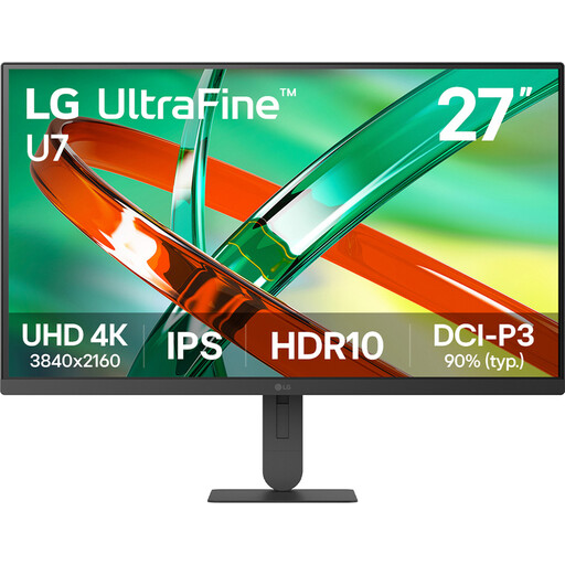 No image available
A 27-inch 4K screen to compare for catalogue images and page details; check that the connections suit your computer.
27 inch; 4K; IPS.
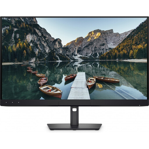 No image available
A 32-inch 4K model to consider for image work and catalogue layout; check that the size and connections suit your shared workspace.
32 inch; 4K UHD; 120 Hz; QD-OLED.
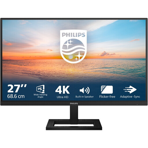 No image available
A 27-inch screen to compare for text and page details; the title mentions a height-adjustable stand for setting up your workspace.
27 inch; 4K UHD; 3840 × 2160; 60 Hz; 4 ms.
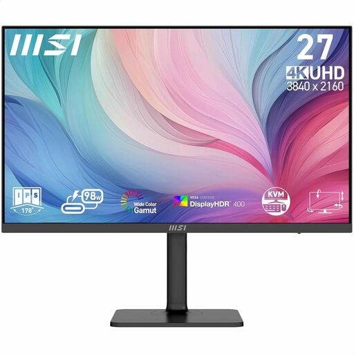 No image available
A 27-inch 4K model to compare for design and photo editing; check that the connection and workspace setup you need are compatible with your equipment.
27 inch; 3840 × 2160; 4K UHD.
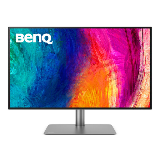 No image available
A 32-inch 4K model to compare for graphic design and shared use; check that the screen size and connections suit your workspace.
32 inch; 3840 × 2160; 4K UHD.
No, not from the screen specification alone. Match the ICC profile to the active display setting and assess the intended output using a suitable output profile and, if needed, a physical proof print. Adobe describes soft proofing as a colour-managed preview for a specific output device.
Check that the ICC profile you have set matches the active screen mode. Adobe warns that a mismatch can disrupt colour reproduction in Creative Cloud applications; if the screen is shared, agree which settings to use.
Not simply because an office is shared. Arboportaal sets out requirements for employees who work with display screens for more than two hours a day, including a height-adjustable, non-reflective screen. It also describes circumstances in which an employer may depart from the requirements, provided safety and health are protected; assess the actual working conditions accordingly.
When you buy as a consumer, you are entitled to a product that is fit for purpose; the Dutch government states that the Netherlands has no fixed statutory warranty period. A manufacturer’s warranty or an extended warranty is in addition to this, and the retailer is your point of contact if there is a problem. Don’t assume the same consumer rights apply when buying on behalf of your office.