
Developer who works with code and previews side by side
If you want to switch between your editor and a local desktop view while developing, consider the available screen space and how you arrange your windows.


For coding alongside a local desktop preview, a QHD screen with a layout that suits your windows is a sensible choice. Choose a taller 3:2 screen if extra vertical workspace is more important to you. If you use a laptop, check separately that the video connection, USB-C features and charging power are compatible with it. None of these screens replaces checking your website on a real phone.
If you want to switch between your editor and a local desktop view while developing, consider the available screen space and how you arrange your windows.
You can view different viewport widths in a browser. Chrome for Developers describes Device Mode as a simulation on a computer; it does not replace testing on a real mobile device.
If you regularly connect your laptop, compare the monitor’s video connection, USB-C features and charging power with what your laptop needs.
Start with the layout you use every day: code and a desktop preview call for different amounts of screen space than a long code page. Then see how well mobile testing, laptop connections and adjustability fit into your setup.
Suitable for: working with code and a local desktop preview side by side, without specifically needing a taller aspect ratio. Dell, LG and Lenovo list QHD models with 2560 × 1440 pixels.
Bear in mind: usable space also depends on window size and scaling settings; try your own editor and browser on the screen.
Suitable for: anyone who values extra vertical space for code, forms or long pages. BenQ lists the RD280U as having a 28.2-inch screen, 3840 × 2560 pixels and a 3:2 aspect ratio.
Bear in mind: BenQ lists 60 Hz via DisplayPort or USB-C; a different aspect ratio does not prove that a responsive design works well.
The table will help you weigh up the other criteria. The percentages indicate which need may be the priority for consumers carrying out this type of development work.
| What to consider | What should you look for? | Who does this matter to? |
|---|---|---|
| Code and desktop preview | Compare resolution, screen size, aspect ratio and physical dimensions. Try your own windows at a comfortable, readable scale. | If I want to see code and a desktop preview at the same time, a practical window layout on my desk matters. Around 36% of consumers prioritise having code and a desktop preview side by side. |
| Checking responsive pages | See whether the browser preview and developer tools fit comfortably alongside your editor. Test different viewport widths and check key interactions on a phone too. | If I check forms and page layouts on narrower screens, I want room for my preview and developer tools. Around 28% of consumers give responsive testing top priority. |
| Connecting and charging a laptop | Check your laptop’s video output, the charging power required, the ports you need and the cables. Compare features using the full model number. | If I connect my laptop often, I want to know whether video and, if needed, charging will work through the connection I choose. Around 18% of consumers prioritise a suitable laptop connection. |
| Positioning the screen comfortably | Consider height adjustment, viewing angle, reflections and the space available on your desk. If you are setting up a workplace for employees, take the relevant health and safety requirements into account. | If I work at my desk for long periods, I want to be able to position the screen to suit me. Around 18% of consumers give workplace comfort top priority. |
Chrome for Developers describes Device Mode as a simulation: the site does not actually run on a phone.
Check different viewport widths as you build, and test important mobile interactions on a real mobile device too.
USB-C features and charging power vary by model. The connection alone does not confirm that video output and power delivery will work with your laptop.
Before you buy, check video output, the charging power required, the ports and the cables at both ends.
If your existing connections do not support the features you want, you may need an extra cable or power adapter.
Philips lists 120 Hz for the Philips 27E1N1600AE/00, while a Joybuy listing for that model says 100 Hz. This discrepancy means the maximum refresh rate is not clear-cut.
Check the full model number, and ask for confirmation of the exact version if the listings conflict.
According to ACM ConsuWijzer, the statutory guarantee is separate from any guarantee offered by the retailer or manufacturer.
Check what an additional guarantee covers, and keep your proof of purchase in case you need to make a complaint to the retailer.
The P2725DE is a 27-inch QHD monitor with USB-C hub features for a laptop workspace.
The RD280U is a 3:2 alternative for anyone looking for extra vertical workspace.
The ThinkVision T27h-30 is a 27-inch QHD model with USB-C docking and ethernet.
According to LG, the 27BA65QB-B combines QHD with USB-C and an adjustable stand.
According to Philips, the 27E1N1600AE/00 is a 27-inch QHD monitor with USB-C.
These monitors suit coding and a local preview, alongside models for a wide laptop workspace or a higher screen resolution. Compare the listed specifications for each model with your own needs and connections.
 No image available
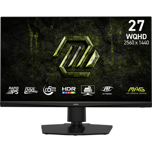
The 27-inch QHD format gives you a starting point for arranging code and a desktop preview in windows on one screen.
The product name lists 2560 × 1440 pixels, 200 Hz and Rapid IPS.
 No image available
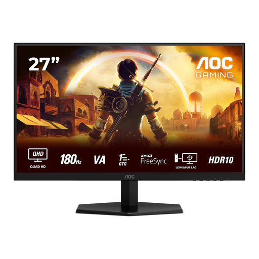
The 27-inch QHD format suits a workspace where you want to arrange code and a local desktop preview side by side.
The product name lists 2560 × 1440 pixels, 180 Hz, IPS, HDMI 2.0 and DisplayPort 1.4.
 No image available
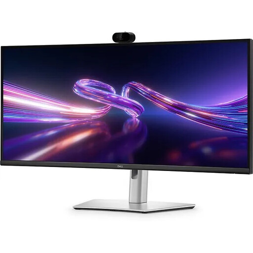
The wide 34.1-inch WQHD format is an option if you want to organise several work windows side by side.
The product name lists USB-C hub features and Power Delivery up to 90 W. Charging is intended for compatible laptops; check that the power output suits yours.
 No image available
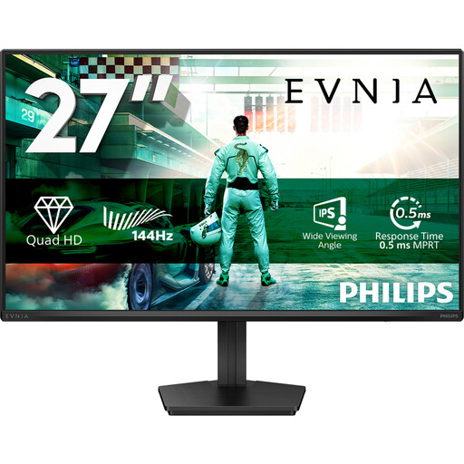
The 27-inch QHD format may suit a layout with code and a desktop preview on the same screen.
The product name lists IPS, 144 Hz, DisplayPort 1.4 and HDMI 2.0.
 No image available
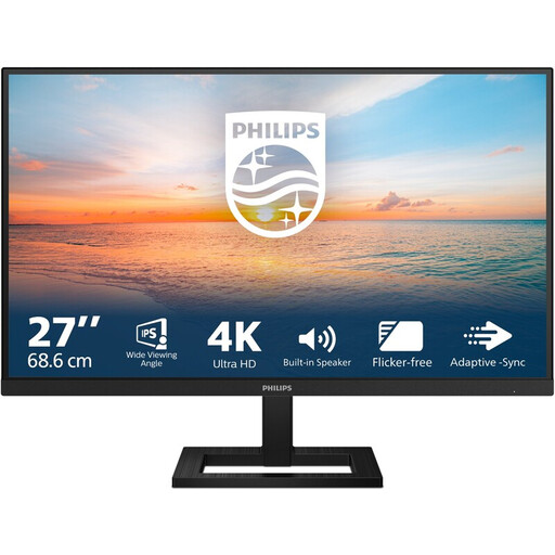
The product name lists a 27-inch 4K UHD screen with 3840 × 2160 pixels, suitable for a workspace with several windows.
The product name also lists 60 Hz, IPS, HDMI and DisplayPort.
No, you can simulate mobile viewport dimensions on your computer. Chrome for Developers makes clear that the site does not actually run on a phone, so check important mobile interactions on a real mobile device too.
No, the USB-C label alone does not confirm that. Compare your laptop’s video output and charging requirements with the features of the exact monitor model; Dell lists 90 W for the P2725DE and LG lists up to 65 W for the 27BA65QB-B.
Check whether you can adjust the screen to a suitable position and whether reflections get in the way of your work. In the Netherlands, there are also regulations on screen-based work for employees; Arboportaal covers aspects such as screen adjustability and lighting, with requirements depending on the working environment.
For eligible online consumer purchases, you generally have a statutory cooling-off period of up to 14 days after delivery; ACM ConsuWijzer also explains the exceptions. The statutory guarantee is separate from any manufacturer’s warranty. If a product does not meet reasonable expectations when used normally, the retailer is your point of contact.
Philips lists 120 Hz, while a Joybuy listing for this model gives 100 Hz. Do not assume a single confirmed maximum rate when making a purchase decision; check the exact version and ask for confirmation if necessary.