
Designer of responsive guides
You switch between design, implementation and narrow-screen layouts. So assess both your workspace and how the guide behaves when zoomed in and reflowed, as explained by the W3C Web Accessibility Initiative.


Choose a monitor based on what matters most for your work: space and sharpness for design windows, colour reproduction for visual decisions, or adjustability and a suitable laptop connection. A monitor won’t make a location guide accessible by itself. Test the content at narrow window widths and when zoomed in, and check the contrast between text and background separately.
You switch between design, implementation and narrow-screen layouts. So assess both your workspace and how the guide behaves when zoomed in and reflowed, as explained by the W3C Web Accessibility Initiative.
You assess text and colour, but check contrast against the WCAG criteria from the W3C Web Accessibility Initiative; a monitor’s claims are no substitute for this.
You may be looking for an adjustable screen position and a connection that suits your laptop. These practical needs matter alongside resolution and colour reproduction.
A good fit if: sharp design details and colour features for visual work are your priorities.
The trade-off: colour coverage and factory calibration don’t prove that a published guide meets accessibility criteria.
A good fit if: you want to work with multiple windows and need an adjustable screen with a suitable laptop hub.
The trade-off: the Dell U2724DE is QHD, not 4K. Check that the workspace suits your text scaling.
A good fit if: adjustability and docking for everyday work matter more to you than specialist design modes.
The trade-off: compare the connection with your laptop. Model specifications don’t prove accessibility or independently measured ergonomic benefits.
| What to consider | What to look for | Who it matters to |
|---|---|---|
| Workspace and reflow | Compare screen size and resolution, but also test the guide at narrow window widths and when zoomed in. For WCAG 2.1 reflow, the W3C Web Accessibility Initiative describes a width of 320 CSS pixels as equivalent to 1280 CSS pixels at 400% zoom. An exception for content such as maps doesn’t automatically apply to the whole page. | When I’m assessing designs alongside narrow-screen layouts, I want enough workspace without overlooking the mobile view. Around 25% of consumers prioritise a responsive workspace. |
| Contrast and readability | Check the text and background combinations in the guide separately. WCAG 2.1 from the W3C Web Accessibility Initiative specifies a minimum ratio of 4.5:1 for normal text and 3:1 for large text, with some exceptions in the criterion. | When I’m checking visual accessibility, I want to know whether the content itself meets the contrast criteria. Around 25% of consumers prioritise this check. |
| Colour reproduction | Check the colour and calibration specifications for the exact model, and assess the contrast of the finished guide separately. | Consistent colour reproduction can matter more than other monitor features for visual design work. Around 19% of consumers choose colour reproduction as their top priority. |
| Adjustable workspace | Check whether the version you’re considering is height-adjustable, and assess reflections and ambient light in your own workspace. | When I work at a screen for long periods, I want to be able to adjust the monitor to suit my workspace. Around 19% of consumers prioritise adjustability. |
| Laptop connection and docking | Compare your laptop’s connection and power requirements with the specifications for the exact monitor model. | When I need a single connection that works with my laptop, docking can be the deciding factor. Around 12% of consumers consider this their main reason for choosing a monitor. |
Reflow and text contrast are properties of the web content under the relevant test conditions, not of the monitor’s label.
Test the guide when zoomed in and at narrow window widths, and check the contrast ratio of each text and background combination separately.
Dell describes the U2724DE as QHD, while the BenQ PD2705U and EIZO EV2740X are described as 4K models.
Compare the full model name and resolution of the version you want to buy.
An extended warranty doesn’t replace your statutory rights. The Dutch government states that there is no fixed statutory warranty period in the Netherlands; what you can expect from a product depends on the product and the circumstances.
Check what extra cover the package provides and which terms or exclusions apply.
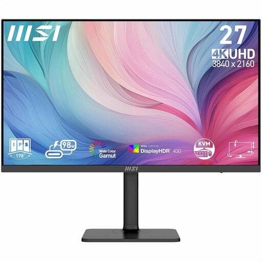
The PD2705U is a 27-inch 4K monitor with sRGB-focused colour features for design work.
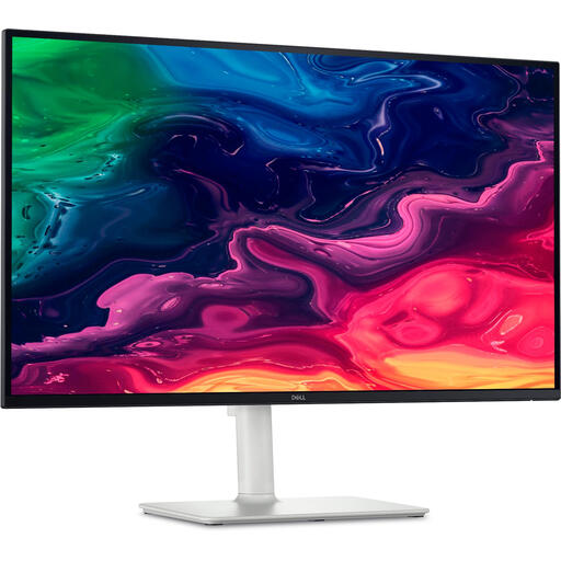
The UltraSharp U2724DE is a 27-inch QHD option with a Thunderbolt hub, for anyone looking for an adjustable screen and a suitable laptop connection.
The FlexScan EV2740X is a 27-inch 4K office monitor with USB-C docking and an adjustable stand.
These are 27-inch 4K monitors for design work. Compare the colour information, adjustability and USB-C power delivery for each model to find what suits your workspace and laptop.
 No image available
An option for design work where high resolution and colour reproduction matter to you. Also test the location guide separately for contrast and reflow.
27 inches; 3840 × 2160; the product description quotes 97% DCI-P3 and 94% Adobe RGB, with factory calibration.
The description lists USB-C with 98 W Power Delivery and an adjustable stand.
 No image available
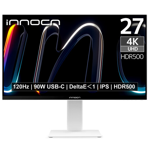
An option if you want to assess design details and colour reproduction. Check the published guide itself for accessibility.
27 inches; 4K UHD; the product specifications quote 100% sRGB and DeltaE < 2.
The product name lists USB-C with 90 W Power Delivery and height adjustment.
 No image available
An option for design windows and a laptop setup where USB-C power delivery could come in handy. Test reflow and contrast separately.
27 inches; 3840 × 2160.
The product details list USB-C with 65 W Power Delivery, plus height and tilt adjustment.
 No image available
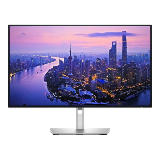
An option for design work where you’re considering 4K resolution and colour information. Check the contrast ratio of the finished content separately.
27 inches; 3840 × 2160; the product description quotes 99% DCI-P3 colour gamut coverage.
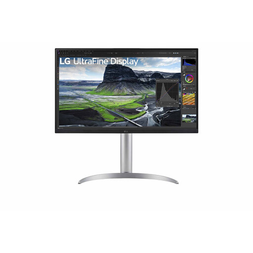 No image available
An option for laptop-based design work where resolution, power delivery and an adjustable setup all matter. Also test the guide when zoomed in and at narrow window widths.
3840 × 2160.
The product description lists USB-C with 90 W Power Delivery, plus height, tilt and swivel adjustment.
No. Test the content itself at different window widths and zoom levels. In its explanation of WCAG 2.1 reflow, the W3C Web Accessibility Initiative gives 320 CSS pixels as the equivalent width and describes exceptions for content that needs a two-dimensional layout, such as maps. This exception doesn’t automatically apply to the whole page.
Adjust the screen height, lighting and setup to suit your workspace, and minimise distracting reflections. Arboportaal explains that for employees who work at a screen for more than two hours a day, the screen and keyboard must not be fixed together. This isn’t a product specification for every individual buyer.
That depends on the provider and the guide’s purpose. DigiToegankelijk describes obligations relating to EN 301 549 and WCAG 2.1 A and AA for government websites and apps covered by the Digital Accessibility of Government Decree. The accessibility requirements that came into force on 28 June 2025 apply to certain commercial products and services within a defined scope; the term ‘location guide’ alone doesn’t mean that every privately run guide is covered. The monitor doesn’t determine the guide’s legal status.
No. The Dutch government states that there is no fixed statutory warranty period in the Netherlands; what you can expect from a product depends on the product and the circumstances. A manufacturer’s warranty is additional. If a product is faulty, contact the seller.
According to the Dutch government, online distance purchases from a business often come with a 14-day cooling-off period. Check the seller’s information and the applicable exceptions.