
Builder of responsive portal pages
You switch frequently between code, source material and the browser, and want to assess page layouts at different viewport widths.


Start with your main task: a QHD or 4K screen can support work with code, pages and source material, while advanced colour features are mainly relevant if you edit historical images. Then check USB-C compatibility and the adjustment options of the exact model. A large or sharp display is no substitute for testing narrow browser widths, as MDN Web Docs explains.
You switch frequently between code, source material and the browser, and want to assess page layouts at different viewport widths.
You regularly work with photos, maps or scans and want to take screen detail and stated colour capabilities into account.
You often connect your laptop and want a monitor that’s practical to connect and easy to position at your workstation.
Best for: mainly text, code and browser windows side by side, without any particular image-editing requirements. Philips describes the 27E1N5600AE/00 as a 27-inch QHD monitor with USB-C.
Keep in mind: QHD has fewer pixels than 4K, but that alone won’t tell you whether a responsive page works well in a narrow viewport.
Best for: anyone who wants to view plenty of detail or multiple windows and connect a compatible laptop via USB-C. Dell states that the P2725QE provides up to 90 W of USB-C power delivery.
Keep in mind: check text scaling and whether your laptop, cable and monitor work together to deliver a picture and sufficient charging power.
Best for: when photos, maps or scans make up a significant part of your work. ASUS lists factory calibration and stated coverage of several colour spaces for the PA279CRV; LG specifies a 27-inch 4K IPS screen for the 27UP850K-W.
Keep in mind: these colour figures are stated by the manufacturer. They’re not independent measurements of your individual monitor, nor a guarantee that images will look the same on visitors’ screens.
First decide what matters most to you: workspace, image editing, connecting your laptop or adjusting your workstation. Then check the specifications of the full model and its compatibility with your computer.
| What to consider | What should you check? | Who is this most important for? |
|---|---|---|
| Workspace for code and pages | Compare screen size and native resolution. Check whether your editor and browser fit side by side at a comfortable text size. | If I want to view code, sources and pages at the same time, a practical layout on my desk matters. Around 33% of consumers making this choice give workspace top priority. |
| Historical images | Compare the exact model and its stated colour spaces or calibration features; don’t treat manufacturer figures as independent measurements. | When I edit lots of photos, maps or scans, I want to consider screen detail and colour capabilities. Around 27% of consumers making this choice put images first. |
| Connecting and charging a laptop | Check whether the laptop and monitor support video over USB-C, how much charging power is available and which cable you need. | If I connect my laptop often, I want to know whether a single cable can provide video and enough power for my device. For around 20% of consumers, this connection is the main priority. |
| Adjustable workstation | Check the height adjustment and any other adjustment options you need on the exact model, as well as the space available on your desk. | If I work at a desk for long periods, I want to position the screen to suit my setup. For around 20% of consumers, workstation adjustability comes first. |
Your monitor’s pixel count won’t show you how a narrow page layout behaves.
Test your portal at different browser widths and check important devices individually.
Whether one cable can carry both video and charging depends on the combined capabilities of the laptop, monitor and cable.
Before buying, compare the video output, required charging power and cable specifications for the exact models.
You may need a different compatible cable or adapter, so check your existing connections first.
A manufacturer’s figures for a monitor aren’t measurements of other screens or of the entire publishing workflow.
Use colour features if they suit your image-editing work, and check portal images on screens beyond your own setup too.
The P2725QE is a 27-inch 4K work monitor with a USB-C hub, designed for a dedicated workstation with a compatible laptop.
The 27E1N5600AE/00 is a 27-inch QHD monitor with USB-C for anyone looking to combine screen space with a laptop connection.
The ProArt PA279CRV is a 27-inch 4K model worth comparing if editing historical images is important to you.
According to LG, the UltraFine 27UP850K-W combines a 27-inch 4K IPS screen with USB-C and an adjustable stand.
These picks focus on 27-inch QHD monitors for working with code, source material and portal pages at a dedicated workstation.
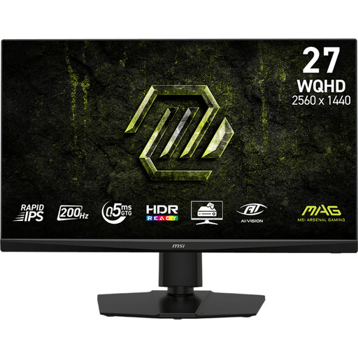 Image unavailable
For working with code and portal pages at a dedicated workstation; the product name specifies a 27-inch QHD screen.
The product name specifies Rapid IPS and 200 Hz.
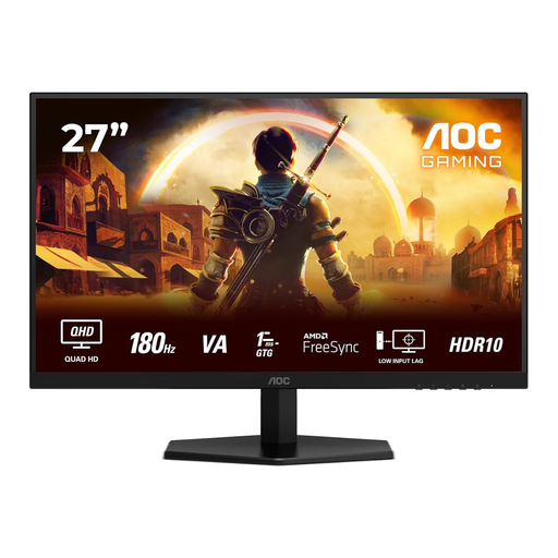 Image unavailable
For viewing portal pages and work windows at a dedicated workstation; the product name specifies Quad HD.
The product name specifies 180 Hz and a 1 ms specification.
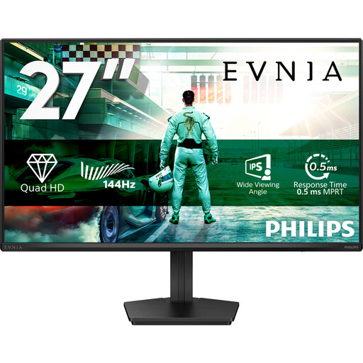 Image unavailable
For viewing pages and source material at a dedicated workstation; the product name specifies a 27-inch QHD screen.
The product name specifies an IPS panel and 144 Hz.
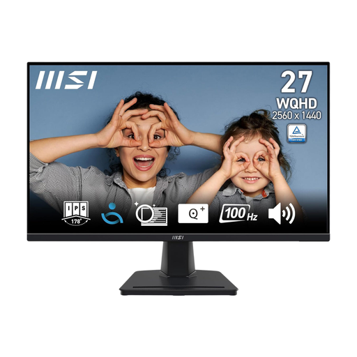 Image unavailable
For working with code and portal pages at a dedicated workstation; the product name specifies a 27-inch Quad HD screen.
The product description specifies an IPS panel and 100 Hz.
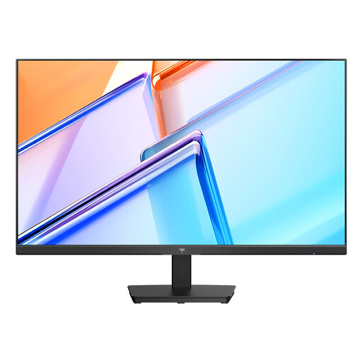 Image unavailable
For working with code and source material on a desktop monitor; the product name specifies a 27-inch QHD screen.
The product name specifies an IPS panel, 120 Hz, HDMI and DisplayPort.
No. Check the page at different browser widths and, where necessary, test it on real devices too. The size of your main monitor alone won’t show you how the site looks on a phone.
No. Check whether your laptop’s USB-C port can output video, how much charging power is needed and which cable is required. Manufacturers describe single-cable use for compatible devices.
Check that you can position the screen to suit your workstation, and take regular breaks from screen work. Arboportaal also outlines rules for employees who spend more than two hours a day working at a screen; this requirement doesn’t automatically apply to every buyer.
According to ACM ConsuWijzer, a standard online consumer purchase generally comes with a statutory cooling-off period that ends 14 days after delivery. Your statutory guarantee is also separate from any stated manufacturer’s warranty period: under the applicable conditions, the seller must offer a solution if the product doesn’t meet what you could reasonably expect during normal use.