
Developer who works with code and previews side by side
You switch between an editor, a local site preview and documentation, so how you arrange your windows is an important consideration.


Choose based on what you want to see at the same time: a standard 27-inch QHD or 4K screen, a taller 3:2 screen and an ultrawide model each offer a different layout for code, previews and documentation. Then check readability at your chosen scaling, compatibility with your computer and adjustability. A large monitor is no substitute for checking other viewport sizes or testing on a real mobile device.
You switch between an editor, a local site preview and documentation, so how you arrange your windows is an important consideration.
You read code and review long consultation pages or forms. Text clarity and vertical screen space may therefore matter.
You regularly connect a laptop and want to match the video connection, suitable power delivery and screen position to your setup.
A good fit if: you want a standard widescreen layout for code and previews, and your laptop can use USB-C for video and suitable power delivery.
Consider: a 27-inch QHD screen has fewer pixels than the 27-inch 4K model mentioned here; the usable space also depends on your scaling settings.
A good fit if: you want to compare more pixels for text and visual checks on a standard widescreen display.
Consider: more pixels do not guarantee more readable workspace; check text and controls at your chosen scaling.
A good fit if: vertical space for code or long consultation forms is a priority. BenQ specifies a 28.2-inch 3:2 screen with a resolution of 3840 × 2560 pixels for the RD280U.
Consider: this aspect ratio gives you a different window layout from an ultrawide screen, but does not automatically provide more room for large windows side by side.
A good fit if: you want to arrange wide windows side by side or switch between two computers. Philips specifies a resolution of 3440 × 1440 pixels and a KVM switch for the 34B2U5600C/00.
Consider: check that the screen fits on your desk and test narrow site layouts separately; the monitor's width does not determine visitors' viewport sizes.
| What to consider | What should you check? | Who should consider this? |
|---|---|---|
| Room for windows | Try the editor and local preview side by side at your intended scaling. Compare widescreen, 3:2 and ultrawide formats with your desk layout. | If I want to see code, previews and documentation at the same time, the window layout matters most. Around 33% of consumers rank room for windows as their top buying priority. |
| Readability | Check text, form fields and keyboard focus at the scaling you actually use. | When I check long forms and code, I want to be able to review text and controls comfortably. Readability comes first for around 27% of consumers. |
| Laptop connection | Compare your laptop's video output, the power it needs, the cable and the USB-C port features on the exact model. | If I connect my laptop regularly, I want to know whether the video and power connections are right for my device. Laptop connectivity is the top buying priority for around 20% of consumers. |
| Screen position | Check the adjustment options, the space available on your desk and any reflections where you plan to use the screen. | When working for long periods, I want to position the screen to suit me and take the light in the room into account. Around 20% of consumers prioritise their workstation setup. |
A simulated viewport does not show every characteristic of a real mobile device.
Use viewport emulation to check layouts, and test important mobile interactions on a real device too. Chrome for Developers describes device mode as a first approximation.
The specified power outputs apply to particular monitor models and do not tell you what your laptop needs.
Before buying, compare your laptop port, its charging requirements, the monitor connection and the cable.
Readability and screen placement also depend on scaling, lighting and your workstation setup.
Try your usual text scaling and check adjustability and reflections in the intended location.
The P2725DE and P2725QE are two 27-inch options with USB-C hubs: QHD and 4K respectively.
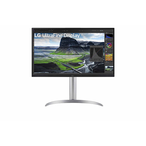
The 27UP850K-W is a 27-inch 4K option with USB-C and an adjustable stand.
The RD280U is a 3:2 screen to compare with standard widescreen and ultrawide layouts.
The 34B2U5600C/00 offers an ultrawide layout and KVM for switching between sources.
The Vero CB272UE3 is another 27-inch WQHD option.
These models are suited to coding and local previews on standard 27-inch 4K or QHD screens, with additional options for using multiple sources and arranging a wide window layout.
 No image available
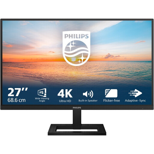
A standard 27-inch widescreen option for viewing code and local previews.
3840 × 2160 pixels; 60 Hz; 4 ms; HDMI and DisplayPort; height-adjustable stand.
 No image available
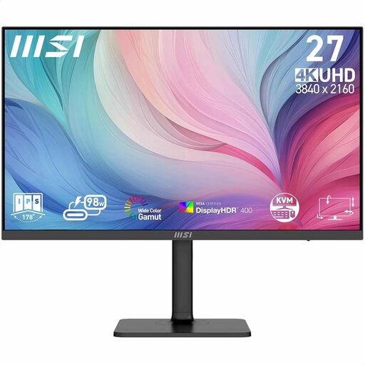
A 27-inch 4K option if you want to view code and previews on a standard widescreen display and use multiple sources in your workflow.
3840 × 2160 pixels; up to 98 W USB-C power delivery; KVM and PIP/PBP; adjustable stand.
 No image available
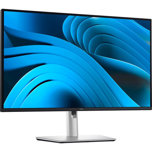
A standard 27-inch QHD option for viewing code and previews, with a USB-C connection to suit your laptop.
2560 × 1440 pixels; USB-C for video, data and up to 90 W power delivery; RJ45; height, tilt and swivel adjustment.
 No image available
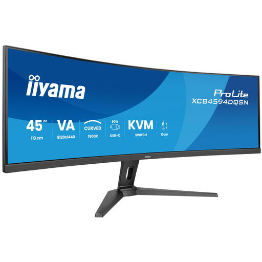
A wide option if you want to arrange code, previews and other windows side by side, or switch between two computers.
5120 × 1440 pixels; KVM switch; USB-C dock; RJ45; height-adjustable stand.
 No image available
A standard 27-inch 4K option for viewing code and previews, with an adjustable screen to suit your workspace.
3840 × 2160 pixels; up to 90 W USB-C power delivery; height, tilt and swivel adjustment.
You can simulate a mobile viewport and adjust its width in Chrome DevTools, but this is only a first approximation: the code is not running on a real mobile device. So check important interactions on a real device too.
Adjust the screen position and lighting to suit your workspace, and check for reflections and contrast with the surroundings. Arboportaal outlines specific requirements for employees who work at a screen for more than two hours a day; this condition does not automatically apply to every buyer.
That depends on your laptop and cable. Compare your laptop's video output and charging requirements with the USB-C features and maximum power output of the exact monitor model. A USB-C port alone does not confirm that the combination is suitable.
According to ACM ConsuWijzer, if a product breaks sooner than expected during normal use, the seller must put it right free of charge, for example by repairing or replacing it, or refunding you. For online purchases, you often have up to 14 days after delivery to change your mind. An additional manufacturer's warranty does not replace your statutory rights.
If the website belongs to a government body, Digitale Overheid states that the Government Digital Accessibility Decree requires accessibility in line with the currently mandatory WCAG 2.1 standard. This requirement cannot automatically be applied to every consultation website. Choosing a monitor does not prove compliance.